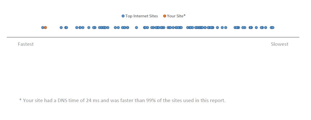
I’ve taken the two-dimension CDF, “Hockey Stick” chart and flattened it into a one-dimension strip. The other aspect regarding the X axes is they are normalized so we may compare variables of different type and magnitude.
We then take this example visual and put into a report (download here). If you want this report generated for your home page, feel free to contact me @LvasiLiou , or using the contact info in slide 2 of the report.

Leave a comment