Web Tortoise

2015-Aug-17

The Chart of the Post

Filed under: CotP — Tags: , — leovasiliou @ 12:55 PM EDT

Bumps - No ColorBumps - Color

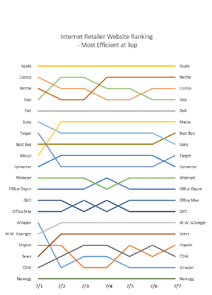
Have taken a data table and turned it into a, “Bumps Chart”.  Like the data table, the Bumps Chart does not show magnitude; it shows just, “first”, “second”, “third”, etc.

Not visible is the metric being charted, which turned out to be the rate per item-byte.

Bumps - Color

#Bumpschart

2015-Jul-08

The Chart of the Post

Filed under: CotP — Tags: — leovasiliou @ 10:54 AM EDT

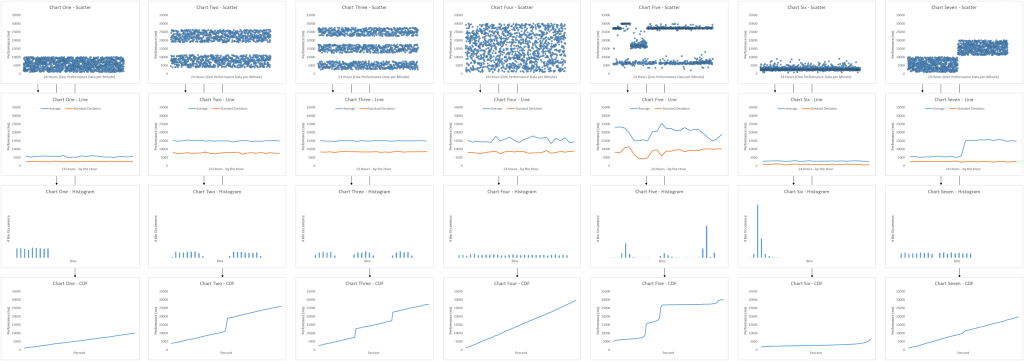
Regarding yesterday’s CotP, an astute reader asked why there was such a focus on the illusory, central-tendency, “Arithmetic Mean Average” but not on the, “Standard Deviation”.  Thought that was a good callout since will generally want to look at both types (a central-tendency type and a dispersion type).  As such, Chart Four has been altered (the previous CotP remains unaltered).

CotP - Recognize From Where Different Shapes Come 2

2015-Jul-07

The Chart of the Post

Filed under: CotP — Tags: — leovasiliou @ 11:06 AM EDT

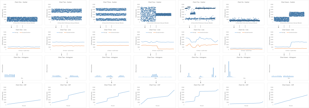
Seeing data in its different information forms and states.

Web performance data sets five and six are actual; the other are illustrative.

CotP - Recognize From Where Different Shapes Come


2015-Mar-11

The Chart of the Post

Filed under: CotP — Tags: — leovasiliou @ 11:47 AM EDT

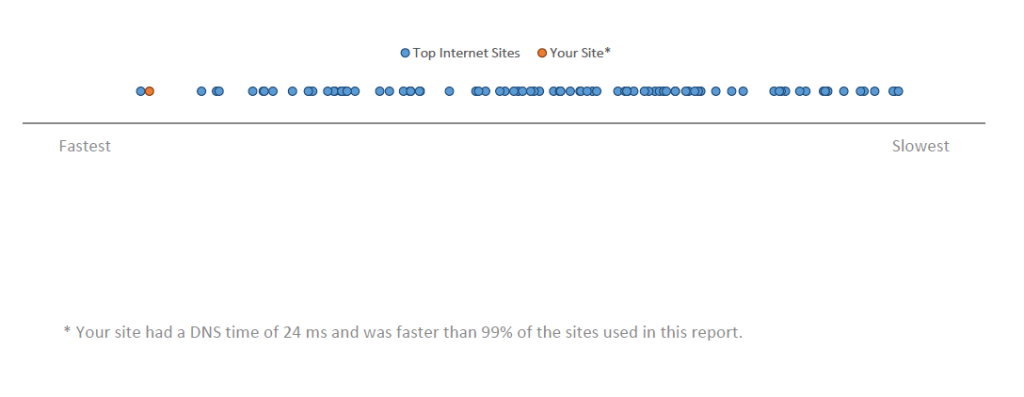
I’ve taken the two-dimension CDF, “Hockey Stick” chart and flattened it into a one-dimension strip.  The other aspect regarding the X axes is they are normalized so we may compare variables of different type and magnitude.

We then take this example visual and put into a report (download here).  If you want this report generated for your home page, feel free to contact me @LvasiLiou , or using the contact info in slide 2 of the report.

CotP - 2D CDF into 1D Strip

2014-Oct-31

The Chart of the Post

Filed under: CotP — Tags: — leovasiliou @ 11:52 AM EDT

CotP - Requests - Response ScatterCotP - Requests - Response Scatter TrendCotP - Bytes - Response ScatterCotP - Bytes - Response Scatter Trend

….

Data from the top 100’ish Internet Retailer default Home Page loads.  Is there correlation between the #Requests and Webpage Response times?

CotP - Requests - Response Scatter

CotP - Bytes - Response Scatter

Special note, the X axis in the two charts are not normalized.

Download excel chart data https://drive.google.com/file/d/0B9n5Sarv4oonUkNDUFE3R1AtUFU/view?usp=sharing

2014-Jul-31

The Chart of the Post

Filed under: CotP — Tags: — leovasiliou @ 06:34 PM EDT

CoTP - Stacked Bar 1 of 4CoTP - Stacked Bar 2 of 4CoTP - Stacked Bar 3 of 4CoTP - Stacked Bar 4 of 4

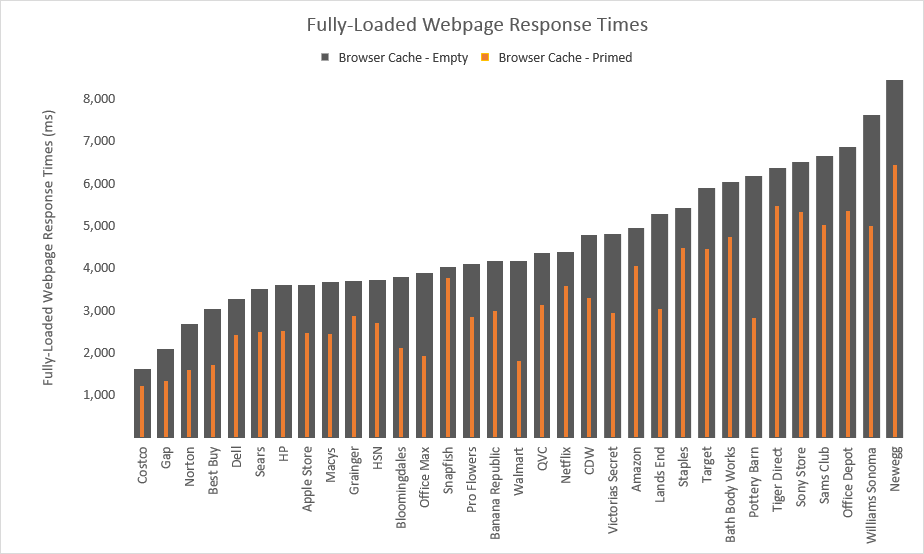
Use a multi-width column (or bar) chart to show change between two data (e.g. performance of a page load with an empty browser cache versus performance of a page load with a primed browser cache).

CoTP - Stacked Bar 1 of 4

Download Excel file here.

Credit and thanks to Jon Peltier for writing how to do this in Excel.

2014-May-31

The Chart of the Post

Filed under: CotP — Tags: — leovasiliou @ 11:59 PM EDT

CoTP Slopgraph Competitive Benchmark 03

CoTP Slopgraph Competitive Benchmark 01

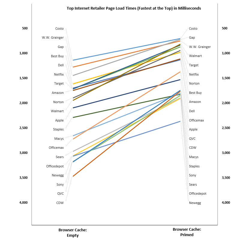
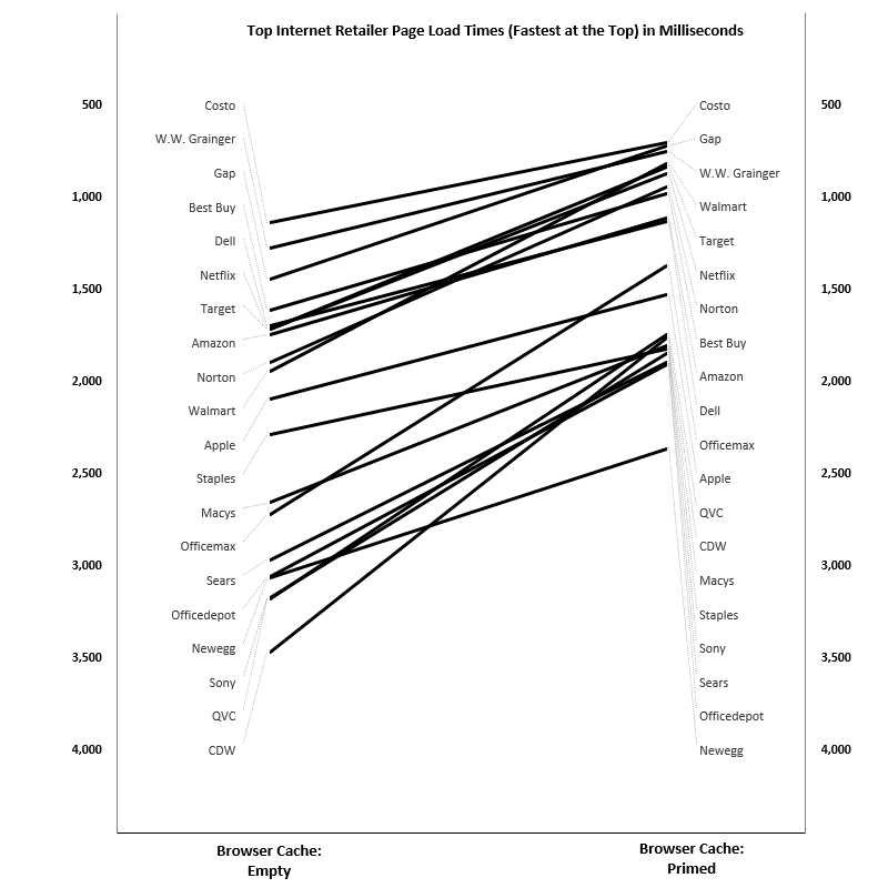
Using a Slopegraph to show change.  In this case, are showing the Page Load Times (in milliseconds) of an, “Empty Browser Cache” versus a, “Primed Browser Cache”.  Note the faster times are toward the top of the Y axis.


CoTP Slopgraph Competitive Benchmark 02

2014-Apr-24

The Chart of the Post

Filed under: CotP — Tags: — leovasiliou @ 11:01 AM EDT

Chart of the Post - 2014-APR-24

Chart of the Post - By the Day

“By the Day” versus “By the Hour”

Chart of the Post - By the Hour


2014-Mar-05

The Chart of the Post

Filed under: CotP — Tags: — leovasiliou @ 06:24 PM EST

Data Becomes Information

Data becomes Information.  The same Data can become different Information.

2014-Feb-09

The Chart of the Post

Filed under: CotP — Tags: — leovasiliou @ 11:28 AM EST

The Chart of the Post

Memory Leak in Progress

Blog at WordPress.com.