Response:
Hello! This #WebTortoise post was written 2013-NOV-27 at 02:28 PM ET (about #WebTortoise).
Main Points
#- Happy Thanksgiving!
#- Use color to add value to your Charts and Graphs.
#- In addition to chart “readability/understandability”, also consider chart “retention/memorability”.
#- Do not be afraid to “play” with your charts and see what you come up with.
#- Chart/Graph Name: Web Performance Heat map ; Shows: Performance, Availability and/or Reliability
Story
The other day, I found this document entitled, “What Makes a Visualization Memorable?” (you can read the document here) and I had the thought to take one of their examples and “play” with it.
Citation note: Borkin MA, Vo AA, Bylinskii Z, Isola P, Sunkavalli S, Oliva A, Pfister H. What Makes a Visualization Memorable?. IEEE Transactions on Visualization and Computer Graphics (Proceedings of InfoVis 2013). 2013.
Now, this document goes on to present for “what makes a visualization memorable” and is a good standalone read. Additionally, though, the document is offered as part of a larger debate where (in my own words) the debate is basically:
Does *only* the chart data need to be presented in order to be understood (i.e. “no” “chart junk” [Tufte]?
-OR-
Does “chart junk” cause us to expend more cognitive effort… thus resulting is more/better understanding (and consequentially more retention and memorability) !?
The document states (and I restate here) it is, “… a first step toward…” the larger, at hand, debate, but I recommend giving it a read because it is interesting by itself.
Now, from Webtortoise’s perspective, I thought I’d pluck one of their chart examples and make it into a Web Performance chart. After looking at the plucked chart, should see why I chose to use it at this particular time of year.
First, their chart.
The Heat Map:

I had previously written a Webtortoise Heat Map article before, but this article is of a different type.
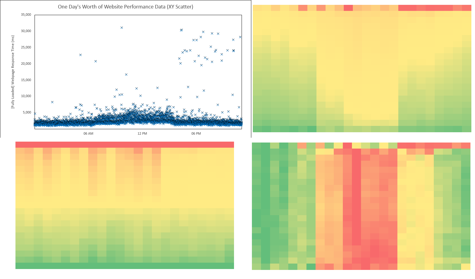
Second (and changing gears to actual Web Performance data), here’s an XY Scatter chart of one-days’ worth of Fully Loaded Webpage Response Time data (we’ll be turning into a Heat Map).
XY Scatter:

Third, turn the XY Scatter into a Heat Map with Time still on the X axis and Percentile Values on the Y axis (to do this, just using Excel’s built-in conditional formatting). Note in this case, the Percentile values are from 0% – 100% (min to max) by 5’s.
Webtortoise Web Performance Heat Map A:

…
Webtortoise Web Performance Heat Map B:

…
Webtortoise Web Performance Heat Map C:

…
Side by Side:
…
The question is, “Which Heat Map more accurately depicts the XY Scatter” (and what’s different about them)?
The differences between A, B and C.
Heat Map A:
Heat Map A had the formatting applied across both axes. In other words, this one shows “the heat” across all of the data. If you look at the Excel file, notice the formatting is applied to cells =$X$27:$AU$47.
Heat Map B:
Heat Map B had the formatting applied across only one axis (in this case, the Hour of Day). In other words, this one shows “the heat” within a given hour. If you look at the Excel file, notice the formatting is applied to each respective column (e.g. =$AA$50:$AA$70).
Heat Map C:
Heat Map C had the formatting applied across only one axis (in this case, the Percentile). In other words, this one shows “the heat” within a given percentile. If you look at the Excel file, notice the formatting is applied to each respective row (e.g. =$X$75:$AU$75).
Having explained the difference, which Heat Map do YOU think more accurately reflects the XY Scatter?
Playing With Your Charts
This Webtortoise post was written a little open-ended, to leave room for a little debate on which Heat Map you’d use in a given situation. We didn’t give much thought to WHY we’d use a Heat Map in the first place (at the core of general “readability/understandability” debate), though. In other words, if the XY Scatter is serving the purpose, why use something else? Hint, because we’re wondering if the Heat Map is more memorable than the XY Scatter.
The answer lies in something I’ve written about before: Do not be afraid to “play” with your charts and see what you come up with. Do any of these Heat Map do as good of a job as the XY Scatter to show:
– between the hours of @ 06 AM to 06 PM, there was clearly some abnormal response times (pretend I clearly had the same time axis label on the Heat Maps as I did on the XY Scatter)?
– after @ 06 PM, there was clearly still some volatility, spurious outliers (that probably still needed attention)?
I don’t know; you tell me. But now that we know some of the ways to construct Heat Maps, we’ll be able to use them in other situations (which would not have happened if we didn’t “play” with them in the first place.
Document Complete / OnLoad:
_The following is optional reading material._
LinkedIn: http://www.linkedin.com/in/leovasiliou
Twitter: @LvasiLiou
Download the Excel document here: https://drive.google.com/file/d/0B9n5Sarv4oonWjZRMjRHdTdmSUk/edit?usp=sharing
#CatchpointUser #ChartsAndDimensions #Performance #SiteSpeed #WebPerformance #Webtortoise #WebPerf #WPO #DataVis
#ExcelHeatMap #ExcelConditionalFormatting
