Response:
Hello! This Webtortoise post was written 2014-MAR-31 at 10:35 PM ET.
Keep in Mind:
#- Credit to Lee Humphries over at http://www.thinkingapplied.com/means_folder/deceptive_means.htm for the idea-inspiring post. Thank you, sir.
#- Download the Excel file here https://drive.google.com/file/d/0B9n5Sarv4oonOGthNk40TTl2RTA/edit?usp=sharing
Story:
Hello, Everyone. In this Webtortoise Story, are going to expand on the concepts of The Web Performance “Hockey Stick” Cumulative Distribution Function (“CDF”) Chart and explore “rates of change between the percentiles”. Specifically, we want to see how the Geometric rate of change between percentiles compares with the actual rate of change between percentiles. We will do this by:
– constructing an actual CDF ;
– constructing a geometric CDF ; and
– then charting both the actual and the geometric .
In this excel sheet, take a look at the raw data sample for the Internet Retailer Top 10 sites (these were simple default home page loads, but underlying measurement theory can apply to any performance metrics). In chart 01 (cell AD5), have constructed the aggregate Hockey Stick CDF chart by calculating all the percentiles and then charting them as a line.

In chart 02 (cell AD32), have constructed the aggregate Hockey Stick, but have instead used the geometric accumulation instead of the actual accumulation.
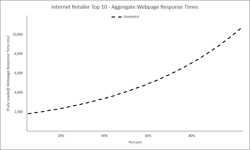
In chart 03 (cell AD59), have plotted the information from charts 01 and 02 together.

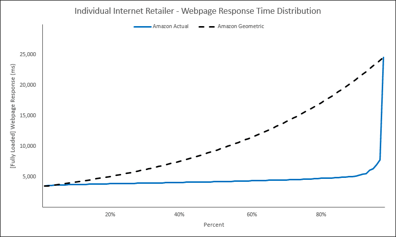
In chart 04 (cell AY119), can now do things like compare the delta between the “actual” versus the “geometric” and use as another data point for studying your web performance. Note the scroll button is cell ax120, to scroll through the IR Top 10.
Optional Reading Material:
Download Excel here https://drive.google.com/file/d/0B9n5Sarv4oonOGthNk40TTl2RTA/edit?usp=sharing.
LinkedIn: http://www.linkedin.com/in/leovasiliou
Twitter: @LvasiLiou
#Analytics #CatchpointUser #ChartsAndDimensions #ChartsAndGraphs #Performance #SiteSpeed #WebPerformance #Webtortoise #WebPerf #WPO #DataVis
#ExcelHockeyStick #WebPerformanceHockeyStick #Percentile #GeometricMean

