Response:
Hello! This #WebTortoise post was written 2013-OCT-31 at 09:36 AM ET (about #WebTortoise).
Main Points
#- Happy Halloween.
#- Use Cycle Plots to compare cyclical points (e.g. from a time-based graph) right next to each other. For example, compare the Response Time of Monday, the 28th right next to the Response Time of Monday, the 21st right next to the Response Time of Monday, the 14th right next to …
#- Chart/Graph Name: Cycle Plot. Shows: Performance, Availability and/or Reliability
Story
Okay, here’s the situation (your parents went away on a week’s vacation?). Are looking at a traditional time-based, #WebPerf line graph showing last week’s Response Times and want to compare some type of cycle (e.g. this Monday versus last Monday versus the prior Monday versus etc or, this noon hour versus the last noon hour versus the prior noon hour versus etc). However, due to the nature of the time series, are unable to do this very easily.
Enter the Cycle Plot.
A Cycle Plot is a type of line graph useful for displaying cyclical patterns. Cycle plots were first created in 1978 by William Cleveland and his colleagues at Bell Labs (Bryan Pierce, A Template for Creating Cycle Plots in Excel).
In this Webtortoise Story, will use a Cycle Plot to see the hours of the day side-by-side. Specifically, we’ll compare the Response Time for each of the 24 hours in a day, for each day of the week.
First, the traditional time-based line:

Straight away, notice Response Time fluctuation potentially effect of peak load versus non-peak load. Going from Midnight (hour, “0”) to Noon (hour, “12”) and then back toward the end of the day (hour, “23”), can see the Response Times rise and fall. Can also see the Response Times on SAT-SUN (weekends) versus MON-FRI (weekdays) are also less (further bolstering the peak versus non-peak theory).
Now, let’s take the above time-based graph and show:
– The Midnight hour of SUN next to the Midnight hour of MON next to the Midnight hour for the rest of the weekdays
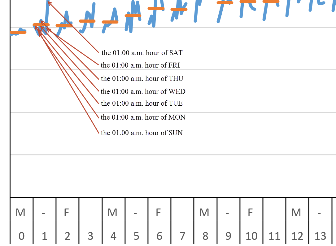
– The 01:00 am hour of SUN next to the 01:00 am hour of MON next to the 01:00 am hour for the rest of the weekdays
– And so on, for each respective hour for each respective weekday
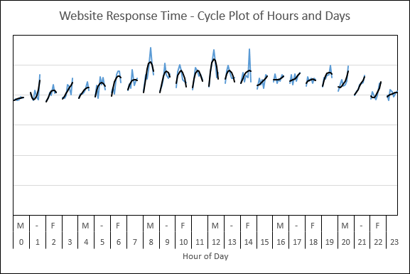
Resulting in the following Cycle Plot:

Reading the Chart: In the above chart, first notice how the breakdowns are switched. Where were showing days below the hours, are now showing the hours below the days. In each of the 24 hour “panels” along the X axis, the blue lines are the individual data for each day of the week where the orange lines are the average for that same respective day.
Now lets “Zoom In” to hopefully crystalize the chart reading.
The Midnight hour:

The 01:00 AM hour:
Insights from the Chart
Now knowing how to read the chart, here are some initial observations:
– Take a look at the orange line averages and see how the overall Response Times definitely rise, starting at around @ 6-7 am
– Take a look at the orange line averages and see how the overall Response Times definitely fall, starting at around @ 7-8 pm
– Within each hourly panel, the first data is SUN and the last data is SAT. Can then say the weekends are faster than the weekdays (could see this in the regular time-based line graph, too, to be fair)
– The Variance/Deviation for some of those peak hours appear to be much higher than for some of those off-peak hours (Just eyeballing e.g. the 11:00 PM or Midnight hour, versus e.g. the 08:00 AM or Noon hour).
Just For Fun
Remove the orange line averages and instead replace them with a second-order trendline. The resulting chart is:
In the above graph, the blue lines are still the individual data. Have just replaced the orange averages with black trendlines.
Notice the shape of most trendlines to be either a candy cane ‘hook’ shape or a small ‘mountain top’ shape. For those trendlines not following that pattern, might investigate further to see why they are different (possible causes: maintenance windows, incidents, releases or etc).
Fair warning: The thought to add a second-order trendline came from the previous observation of the weekends being faster than the weekdays. Recall the first data in each series was SUN and the last data in each series was SAT, so the hook/mountain top shapes re-enforce this. Knowing which graph to use in which situation comes from experience and trial & error; don’t be afraid to ‘play with your graphs’.
Document Complete / OnLoad:
_The following is optional reading material._
LinkedIn: http://www.linkedin.com/in/leovasiliou
Twitter: @LvasiLiou
Google: http://www.google.com/+LeoVasiLiou
Download the Excel file here: https://drive.google.com/file/d/0B9n5Sarv4oonakJzTklGS1N5Q1E/edit?usp=sharing
#CatchpointUser #ChartsAndDimensions #KeynoteUser #Performance #SiteSpeed #WebPerformance #Webtortoise #WebPerf #WPO #DataVis
#ExcelCyclePlot #ExcelPanelChart #ExcelManuallyCalculatingTrendlines
