Response:
Hello! This #WebTortoise post was written 2013-MAR-31 at 09:35 PM ET (about #WebTortoise).
Main Points
Question: How do I tell if the Response Time of my website is affected by traffic load (e.g. peak versus non-peak)?
Answer: Use an Hour of Day chart to correlate whether or not web traffic load affects Response Times. These non-time-based dimension charts allow you to aggregate data over more than one day if, for example, you wanted to look at several days/weeks/etc., but without having to plot several data in a time series.
A traditional time-based line chart may very well answer the asked question. However, at times, may be easy or necessary to look at long periods of time by Hour of Day, especially if there are subtleties to discover. In these examples, are being looked at three months data.
Story
Consider the following two statements, which convey the same idea of change each in a different way.
ABSOLUTE: Our sales went from $1 last year to $2 this year!
RELATIVE: Our sales increased 100% year-over-year!
In this Webtortoise post, will look at Response Times, as they vary through the day, in both Absolute (chart 2) and in Relative (chart 3) terms. The effect of saying the same thing in a different way may be more profound, but must “remember to remember” the context of the overall picture.
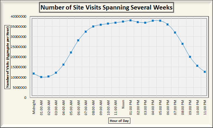
Hour of Day charts, similar to Day of Week, Minute of Hour or other non-time-based charts are powerful ways to analyze the Performance and Availability data of your website. Was asked this question and, in researching, discovered a particular page performing worse than intended, especially compared to another like page on The Company’s site.
This first chart shows the average number of hits (for a 3-month period).
This second chart shows the Response Times for two pages on The Company’s site (for the same 3-month period).

This third chart shows the Response Times for the same two pages as in Chart 2. In this chart, however, the Response Times have been converted to percentages to make them relative on the same scale.

This fourth chart shows all three chart series in one location, with the # Visits on the Primary Axis and the Response Times on the Secondary Axis. Fair warning, this chart is misrepresenting because [intentionally] was removed the Primary and Secondary Axis labeling to avoid confusion.

Now, are talking about the second and third charts for a moment. Because Page 1 and Page 2 (on the second chart) are on the same Y axis, was not so easy to see Page 1 performing substantially worse during peak traffic. However, when changed to a relative % in the third chart, was more easily able to see the Performance delta.
Document Complete / OnLoad:
_The following is optional reading material._
Download Excel Sheet Here.
LinkedIn: http://www.linkedin.com/in/leovasiliou
Twitter: @LvasiLiou
#CatchpointUser #KeynoteUser #GomezUser #Webtortoise #Performance #WebPerformance
#ChartDimensions #HourOfDay #MinuteOfHour #DayOfWeek #Percentile #Histogram
