Response:
Hello! This #WebTortoise post was written 2013-DEC-30 at 02:25 PM ET (about WebTortoise).
Main Points:
#- Always remember the difference between Availability versus Performance. This is especially important when it comes to SLA charting as “traditional” SLA graphs have the calculated Performance lines wanting to be *below* the SLA lines, but where “traditional” SLA graphs have the calculated Availability lines wanting to be *above* the SLA lines. Therefore, if Performance SLA and Availability SLA are charted ambiguously, that vulnerability may lead to misreading of the data.
#- See also: Search for, “Stephen Few Bullet Graph” for the Bullet Graph Design Specification; the Webtortoise’ified work in this post included some of Stephen’s ideas.
#- Chart/Graph Name: Bullet Graph #- Shows: SLA; whether or not you “missed” or “met” the SLA (target).
Story
In this Webtortoise Story, will explore some of the nuances of SLA Charting (from a charting/visual perspective) and discuss some of the options to consider when deciding how to present SLA graphs. Will make use of the Bullet Graph (as per Stephen Few) specification.
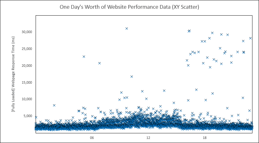
First: it all starts with an XY Scatter. This graph shows one-day’s worth (midnight to midnight) of website performance data, with time on the X axis and the Webpage Response (in milliseconds) on the Y axis.
Now turn this scatter into a line(s) and get something like this:

Then introduce an SLA target. Is hereby declared a Performance SLA of three seconds resulting in something like this:
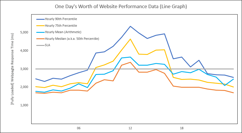
As the above graph is a Performance SLA graph, want the calculated lines to be *below* the SLA line. But here’s where things start to get tricky. Notice, depending on the calculation (e.g. the Median versus the 75th Percentile versus the 90th Percentile), the different calculated lines are above (missed) or below (met) the SLA line at different times! So must further refine the SLA and have chosen this: Ninety percent of the Response Times less than three seconds (This SLA is chosen for just illustrative purpose. Choosing the actual SLA will be different, in different circumstances). Removing those calculated lines except for the 90th Percentile results in this:

Now can say this:
– From the hours of Midnight to 06 AM, were meeting the SLA (the calculated line was below the SLA line).
– From the hours of 07 AM to 07 PM, were missing the SLA (the calculated line was above the SLA line).
– Then, from the hours of 08 PM to Midnight, were meeting the SLA.
Now, here’s where things get trickier. As this is a *Performance* graph, want the calculated line (in this case, the 90th Percentile) to be *BELOW* the SLA line. If, however, this were an *Availability* graph, would want the calculated line to be *ABOVE* the SLA line!
Have seen this *BELOW*/*ABOVE* distinction been graphed with ambiguity in too many cases, so please make sure to not perpetuate.
Traditional Performance SLA graph next to traditional Availability SLA graph (In both graphs, the solid, horizontal black line is the SLA target):

In the above “left” graph, want the calculated line to be *below* the SLA line. But in the “right” graph, want the calculation (in this case, the calculations are bars) to be above the SLA line.
Question: If was not known one graph was Performance and the other Availability, then how would it be known whether the calculation was to be above or below the target to be deemed as either an, “SLA missed” or an, “SLA met”?
Answer: For this reason, do things like add colors (maybe red for “bad” and green for “good”, or maybe dark gray for “bad” and light gray for “good”). Also for this reason, Stephen Few added some alternative designs to his original specification. For reading about Bullet Graphs, I encourage readers to go check out the spec for themselves (do a search for, “Stephen Few Bullet Graph”).
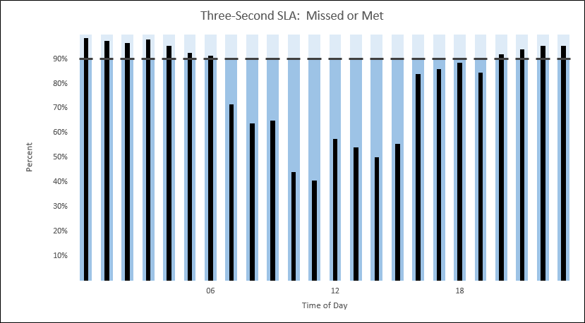
Now, take some of the ideas from Stephen’s specification (specifically, the color shading) and just make the graphs both have the same mechanic. In this case, the mechanic will be to make the Performance SLA graph be considered an, “SLA met” if the calculated line is *above* the SLA line (just like with the Availability graph)!!! This way, regardless of Availability or Performance, will be able to quickly see whether or not the SLA was missed or met!!! Our SLA will remain the same as previously established (Ninety percent of the Response Times less than three seconds), but instead of the actual Response Time on the Y axis, will be the Percent of Response Times under three seconds!
Making these changes results in a graph like this:
…
…
…
When circulating this graph for review, was asked whether or not this was showing Availability or Performance. The answer is: Neither, it is showing a target and whether or not the target was “missed” or “met”. Now, you could infer that “Three-Second…” in the title meant Performance. This is true, but more important, it reinforces the need to normalize the mechanic of presenting either an Availability or Performance SLA graph (because people won’t necessarily read and internalize all of the graph attributes to correctly read what the author is intending).
Last thought on closing, is not technically necessary graph a target and whether or not the target was “missed” or “met”; could easily just type the word “missed” or “met”. But, inevitably, some human comes along and starts asking questions like, “What was the SLA?” “By how much was the SLA missed or met”? And so on.
Document Complete / OnLoad:
_The following is optional reading material._
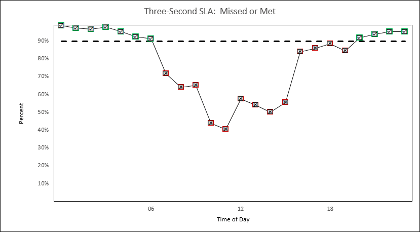
Variants for the Above, “Three-Second SLA: Missed or Met” Graph


LinkedIn: http://www.linkedin.com/in/leovasiliou
Twitter: @LvasiLiou
#Analytics #CatchpointUser #ChartsAndDimensions #Performance #SiteSpeed #WebPerformance #Webtortoise #WebPerf #WPO #DataVis
#BulletGraph #SLA #SLACharting #SLAMonitoring
