Web Tortoise

2014-Jun-30

Cache Is King (And How to Present the Data)

Webtortoise - Cache is King - 3Webtortoise - Cache is King - 4Webtortoise - Cache is King - 5Webtortoise - Cache is King - 6

Response:

Hello! This Webtortoise post was written 2014-JUN-30 at 09:01 PM ET.

Callouts:

#- Use a Slopegraph to display, “change between two data”. For example, use a Slopegraph to display the change in Performance between a, “page load with an empty browser cache” versus a, “page load with a primed browser cache”.

#- In his [recommend you read this] document, Stephen Few talks about using a Slopegraph to display change between two points in time. So, special callout am using the Slopegraph to display change between two non-time points (in this case, “Browser Cache: Empty” versus, “Browser Cache: Primed”.

#- When using a Slopegraph to show Rank, put the “Fastest” time at the Top (more on this below).

#- Usual Webtortoise disclaimers apply.  Whether it’s Document Complete versus Render Start, or IE versus Chrome, or Synthetic versus RUM or “X” versus “Y”… it’s the underlying chart/graph principles that are important.

Story:

Hello everyone. In this WebTortoise Story, am going to use a Slopegraph to visualize the rank in Page Load Times RE: an Empty Browser Cache versus a Primed Browser Cache. Traditional data tables or bar graphs have always been used for this, but as Webtortoise is about the many different ways to visualize web performance data, let us begin.

First, consider a general data table (not unlike the one below). It is showing the “Empty Cache” Average Document Complete Time (in ms) for some of the Internet’s top retail sites:

Webtortoise - Cache is King - 1

Second, consider a similar general data table showing the “Primed Cache” average Document Complete Time (in ms) for those same sites.

Webtortoise - Cache is King - 2

Pause….

Now consider such questions as:

— What is the rank of sites when considering an empty browser cache versus when considering a primed browser cache?

— Does the ordinal rank change?  And if so, by how much?

Now… place the tables side-by-side, draw lines between them and voila! you have your Slopegraph:

Webtortoise - Cache is King - 4

Fastest at the Top

There was much debate about whether or not the “fastest” site should be at the “top” or at the “bottom”.  Since were making a natural progression from a basic data table (which normally has the “fastest” at the top), decided to keep the “fastest” at the top when constructing the Slopegraph.

A Closer Look

One of the powerful capability assets of the Slopegraph is you get to visualize both, “the actual rank” and, “the ordinal rank”. This is exceptionally powerful because when you have *just* the data table, it’s tougher to do things like see clusters, compare magnitudes of change or see rank change(s).

In other words, the ordinal rank says, “So and so is first, such and such is second and so on”. But it does not say, “By how much is such and such second”? That’s why the visual is recommended because it conveys some of this certain information with much less exerted brainpower.

Webtortoise - Cache is King - 6

Optional Reading Material:

Download Excel: https://drive.google.com/file/d/0B9n5Sarv4oonTVd3dm01YWd1dlk/edit?usp=sharing

LinkedIn: http://www.linkedin.com/in/leovasiliou

Twitter: @LvasiLiou

#Analytics #CatchpointUser #ChartsAndDimensions #ChartsAndGraphs #Performance #SiteSpeed #WebPerformance #Webtortoise #WebPerf #WPO #DataVis

#ExcelSlopeGraph #CompetitiveBenchmark #CacheIsKing

2014-Mar-31

The Web Performance Hockey Stick Chart – Part 3 of 4

The Web Performance Hockey Stick Chart -- 3 of 4 -- 1The Web Performance Hockey Stick Chart -- 3 of 4 -- 2The Web Performance Hockey Stick Chart -- 3 of 4 -- 3The Web Performance Hockey Stick Chart -- 3 of 4 -- 4

Response:

Hello!  This Webtortoise post was written 2014-MAR-31 at 10:35 PM ET.

Keep in Mind:

#- Credit to Lee Humphries over at http://www.thinkingapplied.com/means_folder/deceptive_means.htm for the idea-inspiring post.  Thank you, sir.

#- Download the Excel file here https://drive.google.com/file/d/0B9n5Sarv4oonOGthNk40TTl2RTA/edit?usp=sharing

Story:

Hello, Everyone.  In this Webtortoise Story, are going to expand on the concepts of The Web Performance “Hockey Stick” Cumulative Distribution Function (“CDF”) Chart and explore “rates of change between the percentiles”.  Specifically, we want to see how the Geometric rate of change between percentiles compares with the actual rate of change between percentiles.  We will do this by:

– constructing an actual CDF ;

– constructing a geometric CDF ; and

–  then charting both the actual and the geometric .

In this excel sheet, take a look at the raw data sample for the Internet Retailer Top 10 sites (these were simple default home page loads, but underlying measurement theory can apply to any performance metrics).  In chart 01 (cell AD5), have constructed the aggregate Hockey Stick CDF chart by calculating all the percentiles and then charting them as a line.

The Web Performance Hockey Stick Chart -- 3 of 4 -- 1

In chart 02 (cell AD32), have constructed the aggregate Hockey Stick, but have instead used the geometric accumulation instead of the actual accumulation.

The Web Performance Hockey Stick Chart -- 3 of 4 -- 2

In chart 03 (cell AD59), have plotted the information from charts 01 and 02 together.

The Web Performance Hockey Stick Chart -- 3 of 4 -- 3

In chart 04 (cell AY119), can now do things like compare the delta between the “actual” versus the “geometric” and use as another data point for studying your web performance.  Note the scroll button is cell ax120, to scroll through the IR Top 10.

The Web Performance Hockey Stick Chart -- 3 of 4 -- 4

Optional Reading Material:

Download Excel  here https://drive.google.com/file/d/0B9n5Sarv4oonOGthNk40TTl2RTA/edit?usp=sharing.

LinkedIn: http://www.linkedin.com/in/leovasiliou

Twitter: @LvasiLiou

#Analytics #CatchpointUser #ChartsAndDimensions #ChartsAndGraphs #Performance #SiteSpeed #WebPerformance #Webtortoise #WebPerf #WPO #DataVis

#ExcelHockeyStick #WebPerformanceHockeyStick #Percentile #GeometricMean

2014-Feb-28

The Web Performance Hockey Stick Chart — Part 2 of 4

Web Performance Hockey Stick Chart -- 2 of 4 -- 1Web Performance Hockey Stick Chart -- 2 of 4 -- 2Web Performance Hockey Stick Chart -- 2 of 4 -- 3Web Performance Hockey Stick Chart -- 2 of 4 -- 4

Response:

Hello! This WebTortoise post was written 2014-FEB-28 04:59 PM ET.

Keep in Mind:

#- Use a cumulative distribution function (CDF) for its exceptionally-powerful force rank, competitive benchmarking and diff’ing capabilities (Note, in this post have affectionately referred to the CDF as, “The Hockey Stick” chart).

#- Use The Hockey Stick chart to compare fully-distributed performance data to other, fully-distributed performance data.

#- Credit to both Peltiertech.com and Chandoo.org for their logic on how to fill areas with color in Excel. Thank you, Gentlemen.

#- The actual Internet Retailer (“IR”) Top 20 competitive benchmark data in this post was of only the respective home page(s); It is benchmarking the [Fully Loaded] Webpage Response Time metric. Note the theory in this post could apply to any performance data (e.g. a full business transaction) or to any metric (e.g. Wait Time, Load Time or any internal KPI).

#- Constructing The Hockey Stick CDF is a computationally, exceptionally expensive proposition.

Story

Hello, Everyone. The idea of competitive benchmarking is not new. What is new here, however, is the proposed way of using the Hockey Stick CDF to do them.

I’ve found that most existing [web performance] competitive benchmarks do an “OK” job of comparing the summary statistics (e.g. the median or the average). But they don’t do a good enough job of showing the overall picture, nor of showing how far the overall pictures are from each other.

In this Webtortoise Story:

01. Are going to calculate the individual IR Top 20 performance medians and place them along the aggregate IR Top 20 Hockey Stick CDF curve. This will virtuously rank the median values from fastest to slowest.

02. Are going to calculate the Hockey Stick CDF of the individual IR Top 20 and compare to the calculated Hockey Stick CDF of the aggregate IR Top 20.  We will then calculate the net area between them and use that net area number as the mechanism to rank from fastest to slowest.

03. Are going to see whether the two different calculations result in different ranks.

Place the Individual Medians

I’ve run several tests against the IR Top 20 homepages.  Now use those individual test data to create The Hockey Stick CDF (aggregate curve) by using your various percentile functions (e.g. in Excel, use =PERCENTILE.EXC) and calculate the 1st through the 99th percentiles. Then chart these respective percentiles as a line.  In this below chart, there are 99 chart data (one for each of the 1st through 99th percentiles that we just calculated).

Note you may follow along with this excel spreadsheet (This excel spreadsheet was created in excel 2013 (PC) and contains advanced formatting. Unfortunately, the advanced formatting is necessary for this particular post. In the chance everything does not display perfectly, I’ve placed a supplemental PPT here. The PPT will contains various pictures/graphics, though it will not contain the formulas).

Web Performance Hockey Stick Chart -- 2 of 4 -- 1

Now place the individual IR Top 20 medians along the curve.  The long and short is you want your individual median to be as far to the left as possible.  Consider now how we can see better the disparity between the first place versus e.g. the last place.  Not only can we see the delta going up to down, but we can also see the delta going left to right.

Web Performance Hockey Stick Chart -- 2 of 4 -- 2

Compare the Full Hockey Stick CDFs

Now compare the individual IR Top 20 CDF to the aggregate IR Top 20 CDF and then fill the areas between them to [hopefully] give a better visual of just how far apart they are. At this point, be looking at the PPT slide four and beyond, and be looking at “Comparing Full Distributions” sheet of the Excel workbook. Right around cell AJ35 of this “Comparing Full Distributions” sheet, there is a scroll button where you can scroll through the IR Top 20 and see the differences; this post is showing only Costco (the “fastest”) and Macys (shown because it crosses over a few times, and this is a separate conversation on its own).

Web Performance Hockey Stick Chart -- 2 of 4 -- 3

Web Performance Hockey Stick Chart -- 2 of 4 -- 4

When the lines cross each other (perhaps several times) as with the Macys data, it becomes more apparent as to why we need to calculate the net area between the comparison(s).  So, calculate all the “red” area…. calculate all the “green” area and take the difference of the two.  The result will be one of three things:  net faster, net slower or net zero.  By doing it this way, we are now truly comparing the full distribution of the performance data.

Comparing the Ordinal Rank of the Two Different Calculations

There were only slight differences between ranking the two calculations. Or perhaps, that should be phrased as a question instead of a statement. E.g., “Are the differences between ranking the two calculations substantial or insubstantial”? … Interesting. We can say, though, at least the first and last place(s) did not change. So perhaps that’s how we should approach, by doing multiple calculations and seeing the rank that way? So if an entity was in the same slot in multiple methods, then we build confidence… right?

Either way, good job to Costco.  Those are some amazing web performance numbers!

Web Performance Hockey Stick Chart -- 2 of 4 -- 5

Optional Reading Material:

Download Excel File https://drive.google.com/file/d/0B9n5Sarv4oonQzFZbElNQ3NaVkU/edit?usp=sharing

Download PPT File  https://drive.google.com/file/d/0B9n5Sarv4oonS1RIWHpyMzZPdW8/edit?usp=sharing

LinkedIn: http://www.linkedin.com/in/leovasiliou

Twitter: @LvasiLiou

#Analytics #CatchpointUser #ChartsAndDimensions #ChartsAndGraphs #Performance #SiteSpeed #WebPerformance #Webtortoise #WebPerf #WPO #DataVis

#ExcelHockeyStick #WebPerformanceHockeyStick #Percentile #CompetitiveBenchmark

2014-Jan-31

The Web Performance Hockey Stick Chart — Part 1 of 4

Web Performance Hockey Stick Chart -- 1 of 4 -- 6Web Performance Hockey Stick Chart -- 1 of 4 -- 5Web Performance Hockey Stick Chart -- 1 of 4 -- 7Web Performance Hockey Stick Chart -- 1 of 4 -- 8

Response:

Hello! This #WebTortoise post was written 2014-JAN-31 at 08:09 PM ET (about WebTortoise).

Main Points:

#- Use a cumulative distribution function (CDF) for its exceptionally-powerful force rank and competitive benchmarking abilities (Note, in this post have affectionately referred to the CDF as, “The Hockey Stick” chart).

#— When looking at The Hockey Stick chart, study where it tapers/turns.  This is an important attribute and starts us down the path of answering the question, “At what point do I need to be worried about those long tails… those spurious outliers”?  Or perhaps the better question is, “At what point are those spurious outliers not so spurious”?

#- This is the first in the series of The Hockey Stick posts.  Please read and comment/contact @Lvasiliou to shape the rest of the series.

#- Nothing is perfect (therefore, everything is imperfect).  Use different charts and graphs in different ways.

#- Meetups are great.

#- Bookmark this page.

Story

Hello, Everyone.  I wanted to formally introduce the Hockey Stick chart I’ve had the opportunity to show many, many people over the past several months.  Tons of great feedback has been gathered and I’m finally taking the time to write the series about which I’d been speaking.

Now, if I were telling a joke, then the punch line is what was mentioned as the first main point:

Use a cumulative distribution function (CDF) for its exceptionally-powerful force rank and competitive benchmarking abilities

Technically, you could skip some of the background information I’ll be covering if you just wanted to remember the main point (kind of like “give a fish” vs “teach to fish”), but what fun is that?!  At any rate, let’s begin by saying, “It all starts with a scatter”.

It All Starts With a Scatter

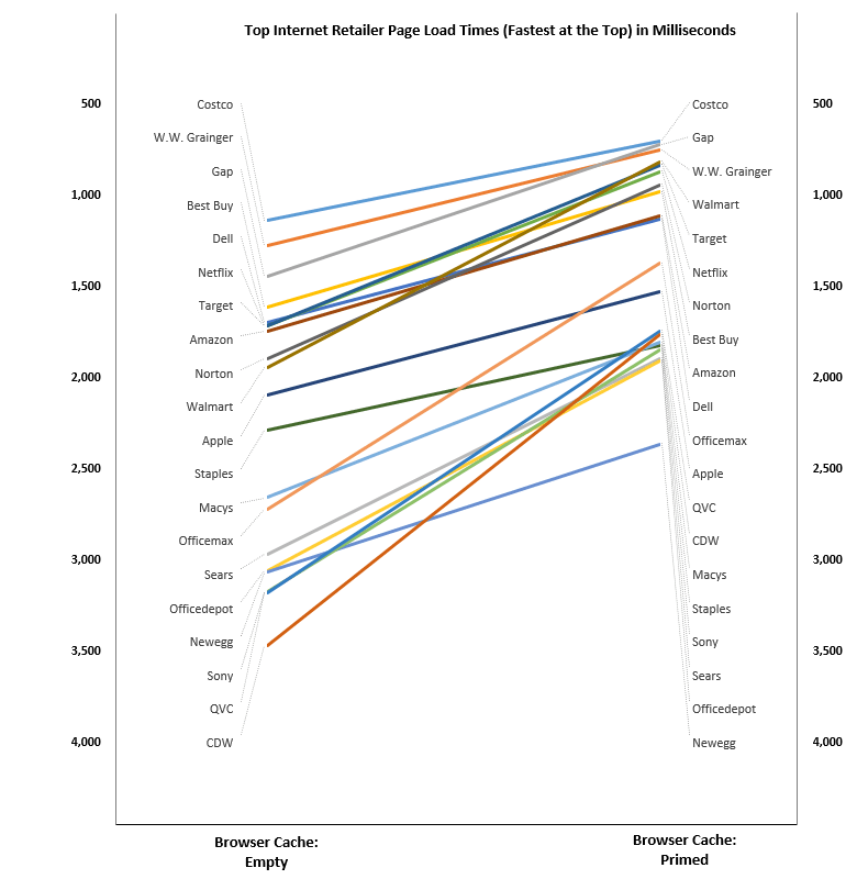
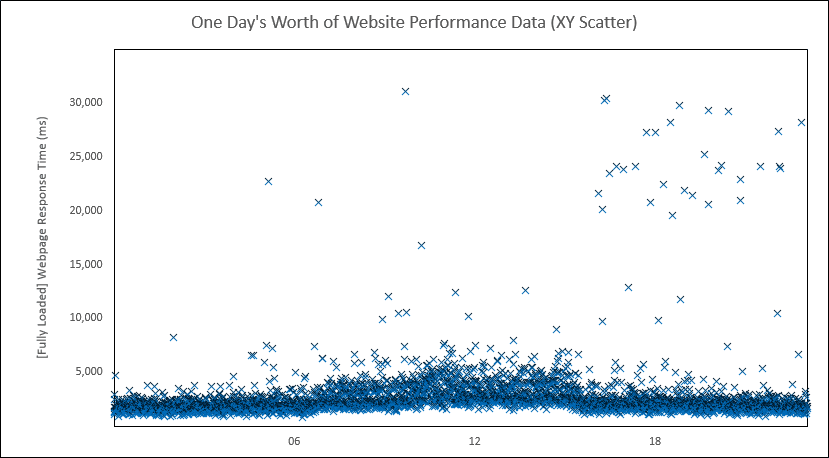
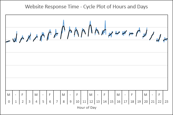
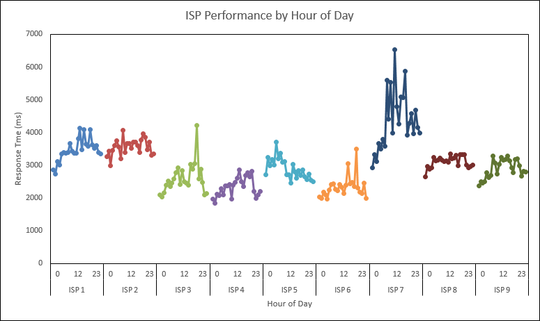
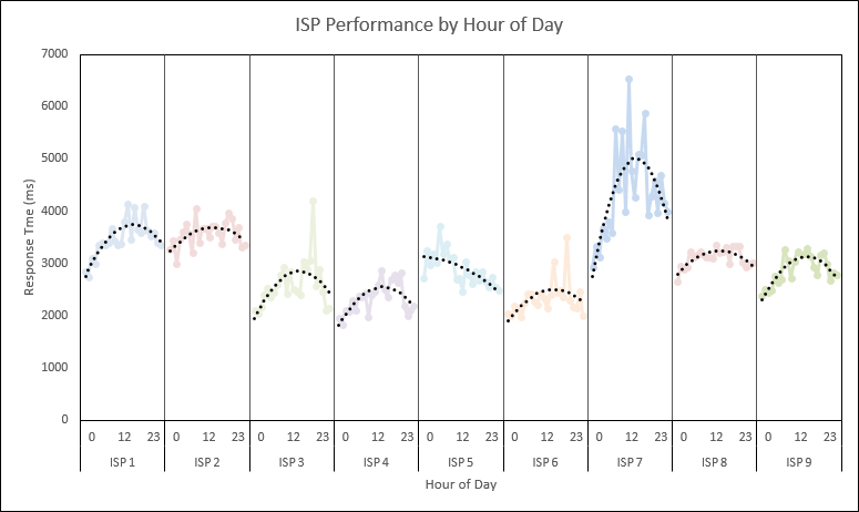
The power of using The Hockey Stick chart as a rank or comparison tool starts first with a basic review of some of the more popular, more known chart types.  In this below scatter, I chose to use some Synthetic data, but it’s important to note The Hockey Stick chart can be used to rank or compare any performance data.

Web Performance Hockey Stick Chart -- 1 of 4 -- 1

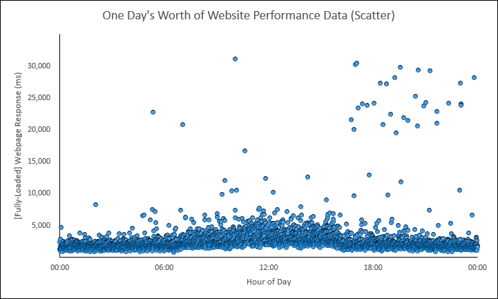
In the above scatter, we are showing one day’s worth of website response times.  There are 3,552 individual data shown across a 24-hour period.  It looks like there was some type of Pattern Change at around 07:00 AM lasting until around 04:30 PM.  And after 04:30 PM, we can clearly see some spurious outliers.

Enter Our Summary Line Charts

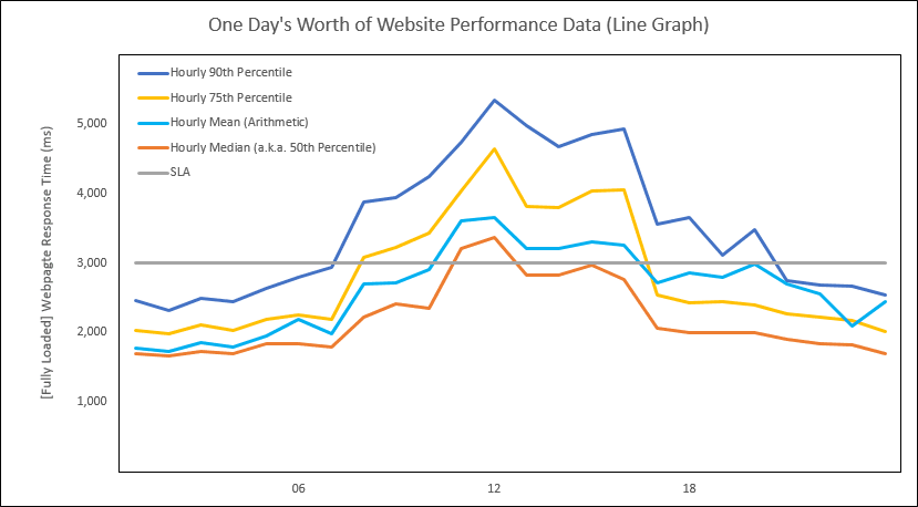
NOTE every chart in the remainder of this post was made from the above XY Scatter NOTE

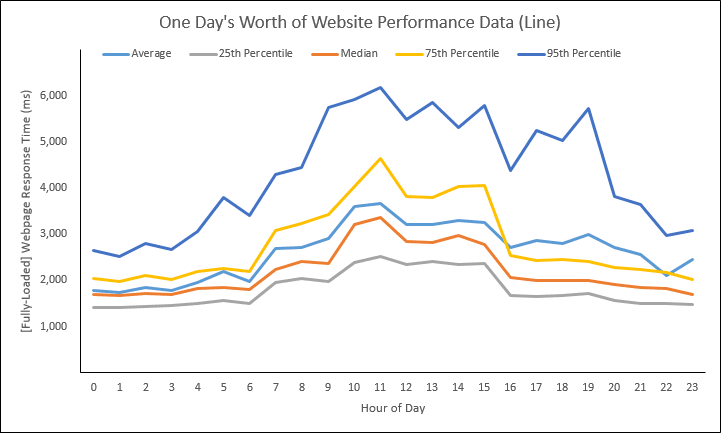
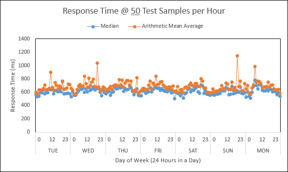
Let’s now take the above scatter and turn it into a line graph.  Using the Arithmetic Mean and Median calculations, we’ll come up with this:

Web Performance Hockey Stick Chart -- 1 of 4 -- 2

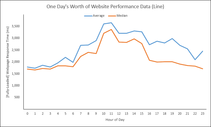
We could also add several percentile calculations (reminder, the Median is a.k.a. the 50th Percentile):

Web Performance Hockey Stick Chart -- 1 of 4 -- 3

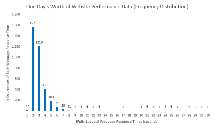
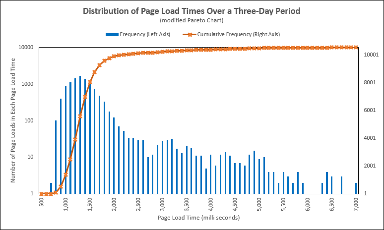
Enter the Frequency Distribution

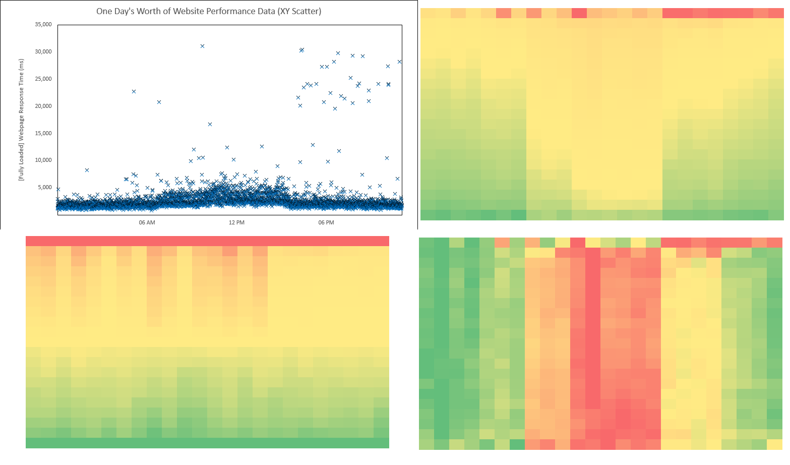
Let’s now take the above scatter and turn it into this below frequency distribution:

Web Performance Hockey Stick Chart -- 1 of 4 -- 4

Going from the scatter… to the summary time-based lines… to this above frequency distribution, we ask the question, “Why else would we need to consider another chart/graph type?  These array of analytic assets give me so much information already!”

My answer is, “Nothing is perfect (everything is imperfect) and I suggest The Hockey Stick chart does a better job than the charts we’ve seen so far when it comes to:

– Comparing full distributions to each other ;

– Correctly placing individual measures along an aggregate curve ; and

– Reading it.”

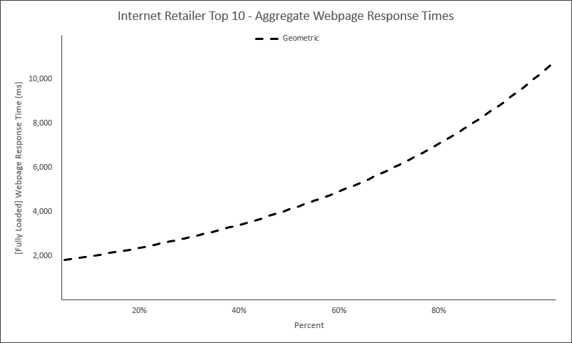
Enter The Hockey Stick

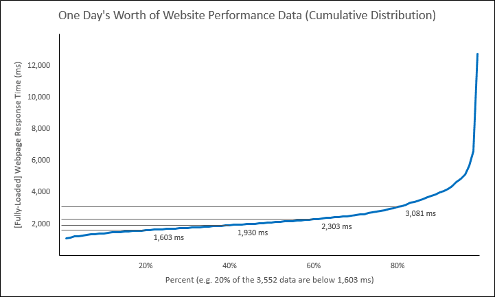
Let’s now take the above scatter and turn it into this below cumulative distribution (The Hockey Stick):

Web Performance Hockey Stick Chart -- 1 of 4 -- 5

Reading the above Hockey Stick will go something like this:

– Twenty percent (X axis) of the 3,552 data (recall this is how many data across that 24-hour period) are below (or equal to) 1,603 milliseconds (Y axis).

– Forty percent (X axis) of the same 3,552 data are below (or equal to) 1,930 milliseconds (Y axis).

– Sixty percent (X axis) of the same 3,552 data are below (or equal to) 2,303 milliseconds (Y axis).

– Eighty percent (X axis) of the same 3,552 data are below (or equal to) 3,081 milliseconds (Y axis).

If you consider when we go from twenty percent to forty percent that it’s “cumulative”, then you now understand what a CDF is!  In other words, the forty percent of the data includes the previously mentioned twenty percent.

Said another way

Envision each of those individual 3,552 data have been dropped into one of those lottery number drawing thingies, we’d say:

– We have a twenty percent chance of pulling a data that is below 1,603 milliseconds.

– We have a forty percent chance of pulling a data that is below 1,930 milliseconds.

– We have a sixty percent chance of pulling a data that is below 2,303 milliseconds.

– We have an eighty percent chance of pulling a data that is below 3,081 milliseconds.

In other words, the CDF, a.k.a. what I’ve affectionately called The Hockey Stick:

describes the probability that a real-valued random variable X with a given probability distribution will be found at a value less than or equal to x” [Wikipedia, CDF Article].

Or, if Mathwave.com’s definition is a little easier, then The Hockey Stick is:

the probability that the variate takes on a value less than or equal to x” (http://www.mathwave.com/articles/distribution_graphs.html).

Question:  Why am I going through the trouble of explaining what a CDF is?

Answer:  Because the Wikipedia article made my head hurt and if you didn’t already know what a CDF is, then reading that article probably would not have changed that.  So I decided to try writing up the explanation this way, in hopes it was more understandable.

Question:  I ventured and read the Wikipedia article and I’m curious why your percent are along the X axis instead of the Y axis?

Answer:  This is the first comment/question most math and stat types ask me.  The short answer is because it’s easier to read this way (at least for me it is).  The longer answer (including graphics) is in the optional reading section toward the bottom of this post.

Question:  If I’m reading this right and the percent is along the X axis, then the Median is right in the middle, between the 40th and 60th percent?

Answer:  Yes, exactly.  The Median is right where I describe and says, “exactly half of the data are below me and exactly half of the data are above me”.

Question:  When am I going to get to ranking and comparing?

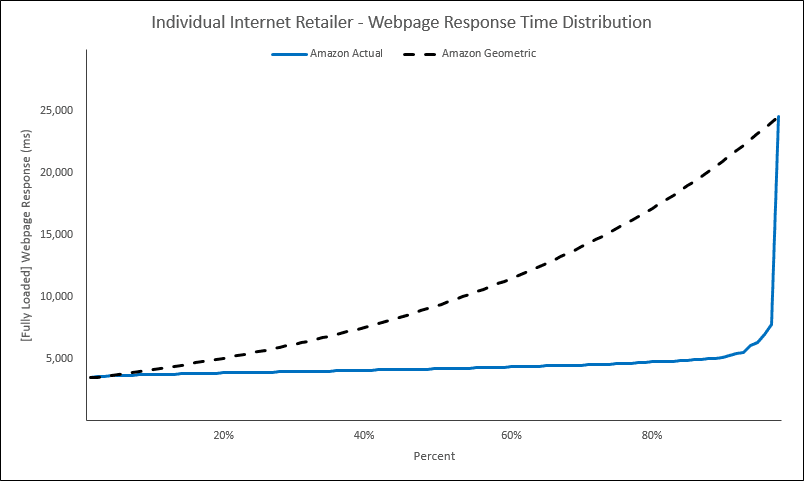
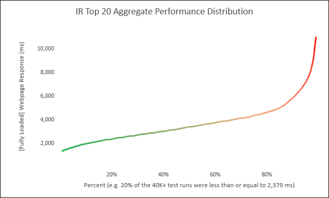
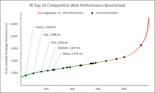
Answer:  We are getting there (To give a little forecast, though, imagine The Hockey Stick is an aggregate performance curve of the Internet Retailer top 20 (or top whatever “X”).  Then imagine we’ll place the performance of each respective, individual IR top 20 along the aggregate curve), but for now, let’s discuss how we create The Hockey Stick.

Creating the Hockey Stick

To create The Hockey Stick, have some raw data, calculate the percentiles and then chart those percentiles using a line.

01.  Have some raw data.

In this example, we are still sticking with the same 3,552 data from the scatter (download the Excel sheet right here).

02.  Calculate the percentiles.

Use built-in functions like PERCENTILE.EXC in Excel to calculate the percentiles for the 1st percentile all the way to the 99th percentile.

— We’ll talk about trimming later, but in case you miss it, you can also calculate instead e.g. the 5th percentile to the 96th percentile.  Doing this is sometimes okay because when you competitive benchmark, the individual performance will not be in those long tails of the aggregate distribution.  It also sometimes makes the chart more readable because the skew may be less.

— In Excel versions earlier than Excel 2010, the percentile functions are broken.

03.  Chart those percentile values with a line and, voila, you have your hockey stick!

In the provided Excel file, the PERCENTILE.EXC functions start in cell V103 and, in this case, we are running on the raw data in column f (F5:F3556 to be exact).  The chart data for this particular hockey stick is from cells V103:V201.

The First Post in This Series

I’m going to stop here for the first post in the series.  May I ask, please take the time to read and contact me @Lvasiliou if you want to discuss, need help understanding or just want to geek out about charts or graphs in general.  Regarding the rest of the series’ posts, here are some general thoughts so far:

– Use The Hockey Sticks and force rank the performance of individuals along an aggregate curve

– Use The Hockey Sticks and compare full distributions to other full distributions

— compare individuals to other individuals

— compare individuals to groups

– Talk about some strategic use of color

Document Complete / OnLoad:

_The following is optional reading material._

Alternative Presentation

Web Performance Hockey Stick Chart -- 1 of 4 -- 5

In the above hockey stick, we charted the 1st percentile all the way through the 99th percentile.  This is great because it shows us the performance of the entire distribution, but those last few percent are really scrunching most of the graph.  So, as an alternative way to present and “spread out” the data:

– chart, as a line, the 5th through the 96th percentile ; and

– chart, as columns, the amount of change from the previous percentile for the full 1st percentile through the 99th percentile.

The Amount of Change:  The first percentile is 1,082 milliseconds; the second percentile is 1,153 milliseconds.  The amount of change between the first and second percentile is 71 milliseconds (1,153 – 1,082 = 71).  Do this for each change and then chart this series as bars.  In the Excel sheet, the “change from previous percentile” series starts in cell AK104.  What this allows you to do is spread the data out a little bit, but still give you an idea of just how bad those extremely long tails really are… in the same chart!

Web Performance Hockey Stick Chart -- 1 of 4 -- 8

Download Excel file:  https://drive.google.com/file/d/0B9n5Sarv4oonVmtMNHBjR21NX0E/edit?usp=sharing

LinkedIn: http://www.linkedin.com/in/leovasiliou

Twitter: @LvasiLiou

#Analytics #CatchpointUser #ChartsAndDimensions #Performance #SiteSpeed #WebPerformance #Webtortoise #WebPerf #WPO #DataVis
#ExcelHockeyStick #WebPerformanceHockeyStick #Percentile

2013-Dec-30

WebTortoise – WebPerf SLA Graphs

Webtortoise - SLA Bullet Graph

Response:

Hello!  This #WebTortoise post was written 2013-DEC-30 at 02:25 PM ET (about WebTortoise).

Main Points:

#-  Always remember the difference between Availability versus Performance.  This is especially important when it comes to SLA charting as “traditional” SLA graphs have the calculated Performance lines wanting to be *below* the SLA lines, but where “traditional” SLA graphs have the calculated Availability lines wanting to be *above* the SLA lines.  Therefore, if Performance SLA and Availability SLA are charted ambiguously, that vulnerability may lead to misreading of the data.

#-  See also:  Search for, “Stephen Few Bullet Graph” for the Bullet Graph Design Specification; the Webtortoise’ified work in this post included some of Stephen’s ideas.

#- Chart/Graph Name:  Bullet Graph  #- Shows:  SLA; whether or not you “missed” or “met” the SLA (target).

Story

In this Webtortoise Story, will explore some of the nuances of SLA Charting (from a charting/visual perspective) and discuss some of the options to consider when deciding how to present SLA graphs.  Will make use of the Bullet Graph (as per Stephen Few) specification.

First:  it all starts with an XY Scatter.  This graph shows one-day’s worth (midnight to midnight) of website performance data, with time on the X axis and the Webpage Response (in milliseconds) on the Y axis.

Webtortoise - SLA Bullet Graph - 1

Now turn this scatter into a line(s) and get something like this:

Webtortoise - SLA Bullet Graph - 2

Then introduce an SLA target.  Is hereby declared a Performance SLA of three seconds resulting in something like this:

Webtortoise - SLA Bullet Graph - 3

As the above graph is a Performance SLA graph, want the calculated lines to be *below* the SLA line.  But here’s where things start to get tricky.  Notice, depending on the calculation (e.g. the Median versus the 75th Percentile versus the 90th Percentile), the different calculated lines are above (missed) or below (met) the SLA line at different times!  So must further refine the SLA and have chosen this:  Ninety percent of the Response Times less than three seconds (This SLA is chosen for just illustrative purpose.  Choosing the actual SLA will be different, in different circumstances).  Removing those calculated lines except for the 90th Percentile results in this:

Webtortoise - SLA Bullet Graph - 4

Now can say this:

– From the hours of Midnight to 06 AM, were meeting the SLA (the calculated line was below the SLA line).

– From the hours of 07 AM to 07 PM, were missing the SLA (the calculated line was above the SLA line).

– Then, from the hours of 08 PM to Midnight, were meeting the SLA.

Now, here’s where things get trickier.  As this is a *Performance* graph, want the calculated line (in this case, the 90th Percentile) to be *BELOW* the SLA line.  If, however, this were an *Availability* graph, would want the calculated line to be *ABOVE* the SLA line!

Have seen this *BELOW*/*ABOVE* distinction been graphed with ambiguity in too many cases, so please make sure to not perpetuate.

Traditional Performance SLA graph next to traditional Availability SLA graph (In both graphs, the solid, horizontal black line is the SLA target):

Webtortoise - SLA Bullet Graph - 5

In the above “left” graph, want the calculated line to be *below* the SLA line.  But in the “right” graph, want the calculation (in this case, the calculations are bars) to be above the SLA line.

Question:  If was not known one graph was Performance and the other Availability, then how would it be known whether the calculation was to be above or below the target to be deemed as either an, “SLA missed” or an, “SLA met”?

Answer:  For this reason, do things like add colors (maybe red for “bad” and green for “good”, or maybe dark gray for “bad” and light gray for “good”).  Also for this reason, Stephen Few added some alternative designs to his original specification.  For reading about Bullet Graphs, I encourage readers to go check out the spec for themselves (do a search for, “Stephen Few Bullet Graph”).

Now, take some of the ideas from Stephen’s specification (specifically, the color shading) and just make the graphs both have the same mechanic.  In this case, the mechanic will be to make the Performance SLA graph be considered an, “SLA met” if the calculated line is *above* the SLA line (just like with the Availability graph)!!!  This way, regardless of Availability or Performance, will be able to quickly see whether or not the SLA was missed or met!!!  Our SLA will remain the same as previously established (Ninety percent of the Response Times less than three seconds), but instead of the actual Response Time on the Y axis, will be the Percent of Response Times under three seconds!

Making these changes results in a graph like this:

Webtortoise - SLA Bullet Graph

When circulating this graph for review, was asked whether or not this was showing Availability or Performance.  The answer is:  Neither, it is showing a target and whether or not the target was “missed” or “met”.  Now, you could infer that “Three-Second…” in the title meant Performance.  This is true, but more important, it reinforces the need to normalize the mechanic of presenting either an Availability or Performance SLA graph (because people won’t necessarily read and internalize all of the graph attributes to correctly read what the author is intending).

Last thought on closing, is not technically necessary graph a target and whether or not the target was “missed” or “met”; could easily just type the word “missed” or “met”.  But, inevitably, some human comes along and starts asking questions like, “What was the SLA?”  “By how much was the SLA missed or met”?  And so on.

Document Complete / OnLoad:

_The following is optional reading material._

Variants for the Above, “Three-Second SLA:  Missed or Met” Graph

Webtortoise - SLA Bullet Graph - 7

Webtortoise - SLA Bullet Graph - 8

Webtortoise - SLA Bullet Graph - 9

LinkedIn: http://www.linkedin.com/in/leovasiliou

Twitter: @LvasiLiou

#Analytics #CatchpointUser #ChartsAndDimensions #Performance #SiteSpeed #WebPerformance #Webtortoise #WebPerf #WPO #DataVis

#BulletGraph #SLA #SLACharting #SLAMonitoring

2013-Nov-27

REMEMBER THIS WEB PERFORMANCE HEAT MAP

Response:

Hello! This #WebTortoise post was written 2013-NOV-27 at 02:28 PM ET (about #WebTortoise).

Main Points

#- Happy Thanksgiving!

#- Use color to add value to your Charts and Graphs.

#- In addition to chart “readability/understandability”, also consider chart “retention/memorability”.

#- Do not be afraid to “play” with your charts and see what you come up with.

#- Chart/Graph Name: Web Performance Heat map ; Shows: Performance, Availability and/or Reliability

Story

The other day, I found this document entitled, “What Makes a Visualization Memorable?” (you can read the document here) and I had the thought to take one of their examples and “play” with it.

Citation note: Borkin MA, Vo AA, Bylinskii Z, Isola P, Sunkavalli S, Oliva A, Pfister H. What Makes a Visualization Memorable?. IEEE Transactions on Visualization and Computer Graphics (Proceedings of InfoVis 2013). 2013.

Now, this document goes on to present for “what makes a visualization memorable” and is a good standalone read. Additionally, though, the document is offered as part of a larger debate where (in my own words) the debate is basically:

Does *only* the chart data need to be presented in order to be understood (i.e. “no” “chart junk” [Tufte]?

-OR-

Does “chart junk” cause us to expend more cognitive effort… thus resulting is more/better understanding (and consequentially more retention and memorability) !?

The document states (and I restate here) it is, “… a first step toward…” the larger, at hand, debate, but I recommend giving it a read because it is interesting by itself.

Now, from Webtortoise’s perspective, I thought I’d pluck one of their chart examples and make it into a Web Performance chart. After looking at the plucked chart, should see why I chose to use it at this particular time of year.

First, their chart.

The Heat Map:

Webtortoise - Which Birth Dates Are Most Common

I had previously written a Webtortoise Heat Map article before, but this article is of a different type.

Second (and changing gears to actual Web Performance data), here’s an XY Scatter chart of one-days’ worth of Fully Loaded Webpage Response Time data (we’ll be turning into a Heat Map).

XY Scatter:

Webtortoise XY Scatter to Heat Map

Third, turn the XY Scatter into a Heat Map with Time still on the X axis and Percentile Values on the Y axis (to do this, just using Excel’s built-in conditional formatting). Note in this case, the Percentile values are from 0% – 100% (min to max) by 5’s.

Webtortoise Web Performance Heat Map A:

Webtortoise Web Performance Heat Map A

Webtortoise Web Performance Heat Map B:

Webtortoise Web Performance Heat Map B

Webtortoise Web Performance Heat Map C:

Webtortoise Web Performance Heat Map C

Side by Side:

Webtortoise XY Scatter to Heat Map - 2 by 2

The question is, “Which Heat Map more accurately depicts the XY Scatter” (and what’s different about them)?

The differences between A, B and C.

Heat Map A:

Heat Map A had the formatting applied across both axes. In other words, this one shows “the heat” across all of the data. If you look at the Excel file, notice the formatting is applied to cells =$X$27:$AU$47.

Heat Map B:

Heat Map B had the formatting applied across only one axis (in this case, the Hour of Day). In other words, this one shows “the heat” within a given hour. If you look at the Excel file, notice the formatting is applied to each respective column (e.g. =$AA$50:$AA$70).

Heat Map C:

Heat Map C had the formatting applied across only one axis (in this case, the Percentile). In other words, this one shows “the heat” within a given percentile. If you look at the Excel file, notice the formatting is applied to each respective row (e.g. =$X$75:$AU$75).

Having explained the difference, which Heat Map do YOU think more accurately reflects the XY Scatter?

Playing With Your Charts

This Webtortoise post was written a little open-ended, to leave room for a little debate on which Heat Map you’d use in a given situation. We didn’t give much thought to WHY we’d use a Heat Map in the first place (at the core of general “readability/understandability” debate), though. In other words, if the XY Scatter is serving the purpose, why use something else? Hint, because we’re wondering if the Heat Map is more memorable than the XY Scatter.

The answer lies in something I’ve written about before: Do not be afraid to “play” with your charts and see what you come up with. Do any of these Heat Map do as good of a job as the XY Scatter to show:

– between the hours of @ 06 AM to 06 PM, there was clearly some abnormal response times (pretend I clearly had the same time axis label on the Heat Maps as I did on the XY Scatter)?

– after @ 06 PM, there was clearly still some volatility, spurious outliers (that probably still needed attention)?

I don’t know; you tell me. But now that we know some of the ways to construct Heat Maps, we’ll be able to use them in other situations (which would not have happened if we didn’t “play” with them in the first place.

Document Complete / OnLoad:

_The following is optional reading material._

LinkedIn: http://www.linkedin.com/in/leovasiliou

Twitter: @LvasiLiou

Download the Excel document here:  https://drive.google.com/file/d/0B9n5Sarv4oonWjZRMjRHdTdmSUk/edit?usp=sharing

#CatchpointUser #ChartsAndDimensions #Performance #SiteSpeed #WebPerformance #Webtortoise #WebPerf #WPO #DataVis

#ExcelHeatMap #ExcelConditionalFormatting

2013-Oct-31

Web Performance – Presenting With a Cycle Plot

Response:

Hello! This #WebTortoise post was written 2013-OCT-31 at 09:36 AM ET (about #WebTortoise).

Main Points

#- Happy Halloween.

#- Use Cycle Plots to compare cyclical points (e.g. from a time-based graph) right next to each other. For example, compare the Response Time of Monday, the 28th right next to the Response Time of Monday, the 21st right next to the Response Time of Monday, the 14th right next to …

#- Chart/Graph Name: Cycle Plot. Shows: Performance, Availability and/or Reliability

Story

Okay, here’s the situation (your parents went away on a week’s vacation?). Are looking at a traditional time-based, #WebPerf line graph showing last week’s Response Times and want to compare some type of cycle (e.g. this Monday versus last Monday versus the prior Monday versus etc or, this noon hour versus the last noon hour versus the prior noon hour versus etc). However, due to the nature of the time series, are unable to do this very easily.

Enter the Cycle Plot.

A Cycle Plot is a type of line graph useful for displaying cyclical patterns. Cycle plots were first created in 1978 by William Cleveland and his colleagues at Bell Labs (Bryan Pierce, A Template for Creating Cycle Plots in Excel).

In this Webtortoise Story, will use a Cycle Plot to see the hours of the day side-by-side. Specifically, we’ll compare the Response Time for each of the 24 hours in a day, for each day of the week.

First, the traditional time-based line:

Webtortoise Cycle Plot Graph 1

Straight away, notice Response Time fluctuation potentially effect of peak load versus non-peak load. Going from Midnight (hour, “0”) to Noon (hour, “12”) and then back toward the end of the day (hour, “23”), can see the Response Times rise and fall. Can also see the Response Times on SAT-SUN (weekends) versus MON-FRI (weekdays) are also less (further bolstering the peak versus non-peak theory).

Now, let’s take the above time-based graph and show:

– The Midnight hour of SUN next to the Midnight hour of MON next to the Midnight hour for the rest of the weekdays
– The 01:00 am hour of SUN next to the 01:00 am hour of MON next to the 01:00 am hour for the rest of the weekdays
– And so on, for each respective hour for each respective weekday

Resulting in the following Cycle Plot:

Webtortoise Cycle Plot Graph 2

Reading the Chart: In the above chart, first notice how the breakdowns are switched.  Where were showing days below the hours, are now showing the hours below the days.  In each of the 24 hour “panels” along the X axis, the blue lines are the individual data for each day of the week where the orange lines are the average for that same respective day.

Now lets “Zoom In” to hopefully crystalize the chart reading.

The Midnight hour:

Cycle Plot Midnight Hour

The 01:00 AM hour:

Cycle Plot 0100 am Hour

Insights from the Chart

Now knowing how to read the chart, here are some initial observations:

– Take a look at the orange line averages and see how the overall Response Times definitely rise, starting at around @ 6-7 am
– Take a look at the orange line averages and see how the overall Response Times definitely fall, starting at around @ 7-8 pm
– Within each hourly panel, the first data is SUN and the last data is SAT. Can then say the weekends are faster than the weekdays (could see this in the regular time-based line graph, too, to be fair)
– The Variance/Deviation for some of those peak hours appear to be much higher than for some of those off-peak hours (Just eyeballing e.g. the 11:00 PM or Midnight hour, versus e.g. the 08:00 AM or Noon hour).

Just For Fun

Remove the orange line averages and instead replace them with a second-order trendline. The resulting chart is:

Webtortoise Cycle Plot Graph 3

In the above graph, the blue lines are still the individual data. Have just replaced the orange averages with black trendlines.

Notice the shape of most trendlines to be either a candy cane ‘hook’ shape or a small ‘mountain top’ shape. For those trendlines not following that pattern, might investigate further to see why they are different (possible causes: maintenance windows, incidents, releases or etc).

Fair warning: The thought to add a second-order trendline came from the previous observation of the weekends being faster than the weekdays. Recall the first data in each series was SUN and the last data in each series was SAT, so the hook/mountain top shapes re-enforce this.  Knowing which graph to use in which situation comes from experience and trial & error; don’t be afraid to ‘play with your graphs’.

Document Complete / OnLoad:

_The following is optional reading material._

LinkedIn: http://www.linkedin.com/in/leovasiliou

Twitter: @LvasiLiou

Google:  http://www.google.com/+LeoVasiLiou

Download the Excel file here:  https://drive.google.com/file/d/0B9n5Sarv4oonakJzTklGS1N5Q1E/edit?usp=sharing

#CatchpointUser #ChartsAndDimensions #KeynoteUser #Performance #SiteSpeed #WebPerformance #Webtortoise #WebPerf #WPO #DataVis

#ExcelCyclePlot #ExcelPanelChart #ExcelManuallyCalculatingTrendlines

2013-Aug-22

Webtortoise Modified Pareto Chart / Modified Ogive Chart

Response:

Hello! This #WebTortoise post was written 2013-AUG-22 at 10:57 AM ET (about #WebTortoise).

Main Points

I had a chance to sit down with Jurgen Cito yesterday and we talked about various Web Performance “stuffs”. One of those stuffs was whether or not there was a spot for Pareto Charts in the Web Performance / WebTortoise Realm.

What do you think?

Story

Modified Pareto Chart (number):

Web Performance Modified Pareto Chart - number

Modified Pareto Chart (percent):

Web Performance Modified Pareto Chart - percent

Looking at the above chart, there are two vertical Y axes:

One of them is a count; the other is a percentage.
One of them is not-cumulative; the other is cumulative.
One of them is a LOG; the other is not a LOG.

At a glance, this chart does not present information effortlessly. It takes a little bit of effort to read and understand (see, Daniel Kahnemann, “Thinking, Fast and Slow” for System 1 versus System 2). But once you do put in the effort, then there is more value to be had.  For example:

– 53% of the Response Times were below 1,300 ms

– 93% of the Response times were below 2,000 ms

Now, I did have to go to the chart data (download link just below) to get those exact numbers.  Perhaps if we play with the chart format a bit? Add some labels (that LOG axis makes it a little trickier to even estimate the corresponding non-LOG % value, for example)?

Interesting….  So many charts…  So little time…

Document Complete / OnLoad:

_The following is optional reading material._

Download the Excel File here: https://docs.google.com/file/d/0B9n5Sarv4oonUG1lR1F5eXRtalE/edit?usp=sharing

LinkedIn: http://www.linkedin.com/in/leovasiliou

Twitter: @LvasiLiou

#CatchpointUser #ChartsAndDimensions #KeynoteUser #Performance #SiteSpeed #WebPerformance #Webtortoise #WebPerf #WPO

#ExcelParetoChart #ExcelOgiveChart

2013-Jul-31

Sampling, Web Performance and YOU

Response:

Hello! This #WebTortoise post was written 2013-JUL-31 at 06:44 PM ET (about #WebTortoise).

Main Points

#- Big Data doesn’t have to be the biggest; it has to be just Big Enough.

#- Sampling versus not sampling can affect your information both negatively or positively. For example, on one end of the spectrum, not sampling at all has effect of missing transient blips or subtle pattern changes. Where, on the other end, sampling at an extremely low rate has effect of being noisy, choppy or volatile.

#- Always remember Performance versus Availability. For example, the rate for your passive Performance data may be different than the rate for your active Synthetic data.

#- Nothing is perfect. Therefore, everything is imperfect.

Story

In this Webtortoise story, going to look at the impact of sampling as it pertains to web performance measurements. Started with a week’s worth of data (no particular reason for a week’s worth; just have settled on that as a default time period), totaling @ 42K test samples (@ 250 per hour).

In this below chart 1, we’re looking at both a Median and Arithmetic Mean Average Performance chart calculated using all of the 250 Synthetic Test Samples per hour. Nice and smooth… Can see some fluctuation during peak vs non-peak… Arithmetic Mean versus Median is not too large of a delta… All in all, not a bad looking chart.

Sampling Web Performance and YOU 1

Now compare with this below chart 2 except are randomly selecting from the same data set to plot based on 50 test samples per hour.

Sampling Web Performance and YOU 2

Now compare with this below chart 3 except are randomly selecting from the same data set to plot based on 10 test samples per hour.

Sampling Web Performance and YOU 3

Last, now compare with this below chart 4 except we’ve applied a basic data smoother to the “10 samples per hour” chart.

Sampling Web Performance and YOU 4

Then put chart 1 and chart 4 side-by-side! If the chart titles were removed, would you be able to pick the one at 250 test samples per hour versus at 10 test samples per hour?

Sampling Web Performance and YOU 5

Document Complete / OnLoad:

_The following is optional reading material._

LinkedIn: http://www.linkedin.com/in/leovasiliou

Twitter: @LvasiLiou

Download the Excel document here https://docs.google.com/file/d/0B9n5Sarv4oonTl81cF9XQzZhaUE/edit?usp=sharing

#CatchpointUser #ChartsAndDimensions #KeynoteUser #Performance #SiteSpeed #WebPerformance #Webtortoise #WebPerf #WPO

#Sampling #DataSmoothing #Statistics

2013-Jun-12

Web Performance Charts in Action – Panel Charts

Response:

Hello! This #WebTortoise post was written 2013-JUN-12 at 02:45 PM ET (about #WebTortoise).

Main Points

#- Use panel charts for certain web performance data to make reading them easier.
#- Will need to manually calculate trend lines for panel chart data as the Excel built-in trend line function(s) ‘spans panels’.
#- Excel Line Chart, Excel Panel Chart

Story

In Webtortoise World, are constantly looking at Performance and Availability data by various dimensions. Can look at data by Host (Performance of Host1 vs Host2 vs etc), by ISP (Performance of Verizon vs L3 vs etc), by Geography (Performance of East Coast vs West Coast vs etc) and by etc. The problem is can be tough to discern and understand when there are a lot of chart data on a single chart.

Enter panel charts.

Panel charts take multiple chart data and split them into separate ‘panels’, while still being on a single chart (the illusion is of multiple charts, though). These panel charts are generally shown side-by-side and have the benefit of using the same axes (by default).

A non-panel chart:

This first chart is not a particularly atypical chart type. It shows respective median Response Times, for a 24-hour period (2013-JUN-06 to be exact), by ISP. It could be Synthetic data, could be RUM data or could be data from any other instrumental ‘ruler’. Is not important this Breakdown is by ISP (the Breakdown could be anything really). What IS important is to concede how tough it is to read the individual measurements. Who’s the worst performer? Who’s the best performer? Are they all following the same trend?

The Charts and Dimensions of Availability and Performance

The panel chart:

Is taken the above line chart and made into this below panel chart, with each of the respective ISP’s Performance data in their own panel. With [intentionally] no additional formatting, can more easily read the information (No additional formatting was applied so as to compare only the layout change. Purpose is to convey the value of the panel chart based on its own merit).

The Charts and Dimensions of Performance and Availability

The panel chart with additional formatting:

One thing would not ever attempt to do with the first chart is add a trend line for each series! Shudder to think how much of a hot mess that’d have been! With the panel chart, though, adding trend lines makes the chart even more valuable (In this case, added 2nd-order Polynomial trend lines as might expect a Performance pattern to be similar to peak traffic pattern). Note to add trend lines to each panel means to manually calculate the trend line for each series (see article link in the below optional section) as Excel’s built-in trend line capability ‘spans panels’.

The Charts and Dimensions of Performance and Availability

Let’s go back and answer some of those initial questions:

Q: Who’s the worst performer?
A: ISP 7 is clearly the worst performer.

Q: Who’s the best performer?
A: ISPs four and six are neck-and-neck for ‘the best performer’.

Q: Are they all following the same trend?
A: No! While each other ISP has a slight Performance degradation during peak traffic, ISP 5 is actually trending down!

Document Complete / OnLoad:

_The following is optional reading material._

LinkedIn: http://www.linkedin.com/in/leovasiliou

Twitter: @LvasiLiou

Download Excel file here https://docs.google.com/file/d/0B9n5Sarv4oonMVhPVGVLRXBXdEk/edit?usp=sharing

Manually Calculate Trendlines in Excel http://www.slideshare.net/ksatyamahesh/computing-trendline-values-in-excel

PeltierTech Article on Panel Charts http://peltiertech.com/Excel/ChartsHowTo/PanelChart1.html

#CatchpointUser #ChartsAndDimensions #KeynoteUser #Performance #SiteSpeed #WebPerformance #Webtortoise #WebPerf #WPO
#ExcelManuallyCalculatingTrendline #ExcelPanelChart #ExcelTrellisChart #SmallMultiples

Blog at WordPress.com.