Web Tortoise

2013-Jul-31

Sampling, Web Performance and YOU

Response:

Hello! This #WebTortoise post was written 2013-JUL-31 at 06:44 PM ET (about #WebTortoise).

Main Points

#- Big Data doesn’t have to be the biggest; it has to be just Big Enough.

#- Sampling versus not sampling can affect your information both negatively or positively. For example, on one end of the spectrum, not sampling at all has effect of missing transient blips or subtle pattern changes. Where, on the other end, sampling at an extremely low rate has effect of being noisy, choppy or volatile.

#- Always remember Performance versus Availability. For example, the rate for your passive Performance data may be different than the rate for your active Synthetic data.

#- Nothing is perfect. Therefore, everything is imperfect.

Story

In this Webtortoise story, going to look at the impact of sampling as it pertains to web performance measurements. Started with a week’s worth of data (no particular reason for a week’s worth; just have settled on that as a default time period), totaling @ 42K test samples (@ 250 per hour).

In this below chart 1, we’re looking at both a Median and Arithmetic Mean Average Performance chart calculated using all of the 250 Synthetic Test Samples per hour. Nice and smooth… Can see some fluctuation during peak vs non-peak… Arithmetic Mean versus Median is not too large of a delta… All in all, not a bad looking chart.

Sampling Web Performance and YOU 1

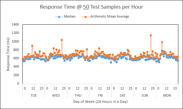
Now compare with this below chart 2 except are randomly selecting from the same data set to plot based on 50 test samples per hour.

Sampling Web Performance and YOU 2

Now compare with this below chart 3 except are randomly selecting from the same data set to plot based on 10 test samples per hour.

Sampling Web Performance and YOU 3

Last, now compare with this below chart 4 except we’ve applied a basic data smoother to the “10 samples per hour” chart.

Sampling Web Performance and YOU 4

Then put chart 1 and chart 4 side-by-side! If the chart titles were removed, would you be able to pick the one at 250 test samples per hour versus at 10 test samples per hour?

Sampling Web Performance and YOU 5

Document Complete / OnLoad:

_The following is optional reading material._

LinkedIn: http://www.linkedin.com/in/leovasiliou

Twitter: @LvasiLiou

Download the Excel document here https://docs.google.com/file/d/0B9n5Sarv4oonTl81cF9XQzZhaUE/edit?usp=sharing

#CatchpointUser #ChartsAndDimensions #KeynoteUser #Performance #SiteSpeed #WebPerformance #Webtortoise #WebPerf #WPO

#Sampling #DataSmoothing #Statistics

2012-Mar-07

Christmas in Excel

Response:

Hello! This was written 2012-MAR-07 at 01:42 PM ET.

Use color to add value to your Performance charts. Red and green columns overlay your line chart where red equals an “increase in Response time from previous interval” and green equals “decrease in Response time from previous interval”.

The following excel waterfall chart has the aforementioned conditions applied (red equals an “increase in Response time from previous interval” and green equals “decrease in Response time from previous interval”). In this case, the waterfall chart is showing week-over-week Response time for a landing page. Credit to peltiertech.com for the waterfall template; my additional formatting has been applied.

Excel Waterfall

Document Complete / OnLoad:

_The following is optional reading material._

Suppose you’re an academic site, perhaps a Search Engine or a Reference site. You might theorize the September change in Response time is impact from everyone going ‘back to school’. To further your theory, notice the December change, when everyone is ‘home for the holidays’. What else might you look for? Maybe three ‘reds in a row’, to spot a trend?

Download excel file: https://docs.google.com/open?id=0B9n5Sarv4oonSEhDZklWb3RUZWl5LTVlcE1sbUpTdw

Search for the PeltierTech article:  http://www.ask.com/web?q=excel+waterfall+chart+peltiertech

# Excel conditional formatting ; Excel conditional charting ; Web Performance Optimization ; Catchpoint ; Keynote ; Gomez ; Excel ; Statistics

2012-Feb-29

Introduction

Filed under: Introduction — Tags: , , , , , , — leovasiliou @ 11:10 AM EST

Response:

Hello! This was written 2012-FEB-29 at 10:54 AM ET.

Welcome to The Web Tortoise and Hare‘s inaugural post. If you are a Catchpoint, Keynote, Gomez or etc user, then this is for you!

Here will be discussed various web availability, performance and “plus plus” topics. Will slant toward using excel to get additional value from the data provided by companies like Catchpoint, Keynote and Gomez.

Availability: Did you get a response from the server?

Performance: After the response, how long did it take for your web page to load?

“Plus Plus”: Could the time of day have affected the web page load? What other factors might influence either availability or performance? Geography? Ad Serving? Else?

Document Complete / OnLoad:

_The following is optional reading material._

I work for a large internet company [at the time of this inaugural post] whose pages receive several visits each month. I use tools like [those provided by] Catchpoint and Keynote to monitor availability and measure performance. I don’t work for any of those companies and I don’t have anything to sell.

Feel free to contact me http://www.linkedin.com/in/LeoVasiliou .

# The Information Diet ; Web Performance Optimization ; Catchpoint ; Keynote ; Gomez ; Excel ; Statistics

Blog at WordPress.com.