Response:
Hello! This #WebTortoise post was written 2013-AUG-22 at 10:57 AM ET (about #WebTortoise).
Main Points
I had a chance to sit down with Jurgen Cito yesterday and we talked about various Web Performance “stuffs”. One of those stuffs was whether or not there was a spot for Pareto Charts in the Web Performance / WebTortoise Realm.
What do you think?
Story
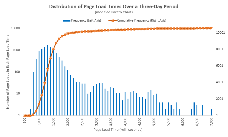
Modified Pareto Chart (number):
Modified Pareto Chart (percent):

Looking at the above chart, there are two vertical Y axes:
One of them is a count; the other is a percentage.
One of them is not-cumulative; the other is cumulative.
One of them is a LOG; the other is not a LOG.
At a glance, this chart does not present information effortlessly. It takes a little bit of effort to read and understand (see, Daniel Kahnemann, “Thinking, Fast and Slow” for System 1 versus System 2). But once you do put in the effort, then there is more value to be had. For example:
– 53% of the Response Times were below 1,300 ms
– 93% of the Response times were below 2,000 ms
Now, I did have to go to the chart data (download link just below) to get those exact numbers. Perhaps if we play with the chart format a bit? Add some labels (that LOG axis makes it a little trickier to even estimate the corresponding non-LOG % value, for example)?
Interesting…. So many charts… So little time…
Document Complete / OnLoad:
_The following is optional reading material._
Download the Excel File here: https://docs.google.com/file/d/0B9n5Sarv4oonUG1lR1F5eXRtalE/edit?usp=sharing
LinkedIn: http://www.linkedin.com/in/leovasiliou
Twitter: @LvasiLiou
#CatchpointUser #ChartsAndDimensions #KeynoteUser #Performance #SiteSpeed #WebPerformance #Webtortoise #WebPerf #WPO
#ExcelParetoChart #ExcelOgiveChart

Leave a comment