Web Tortoise

2014-Jun-30

Cache Is King (And How to Present the Data)

Webtortoise - Cache is King - 3Webtortoise - Cache is King - 4Webtortoise - Cache is King - 5Webtortoise - Cache is King - 6

Response:

Hello! This Webtortoise post was written 2014-JUN-30 at 09:01 PM ET.

Callouts:

#- Use a Slopegraph to display, “change between two data”. For example, use a Slopegraph to display the change in Performance between a, “page load with an empty browser cache” versus a, “page load with a primed browser cache”.

#- In his [recommend you read this] document, Stephen Few talks about using a Slopegraph to display change between two points in time. So, special callout am using the Slopegraph to display change between two non-time points (in this case, “Browser Cache: Empty” versus, “Browser Cache: Primed”.

#- When using a Slopegraph to show Rank, put the “Fastest” time at the Top (more on this below).

#- Usual Webtortoise disclaimers apply.  Whether it’s Document Complete versus Render Start, or IE versus Chrome, or Synthetic versus RUM or “X” versus “Y”… it’s the underlying chart/graph principles that are important.

Story:

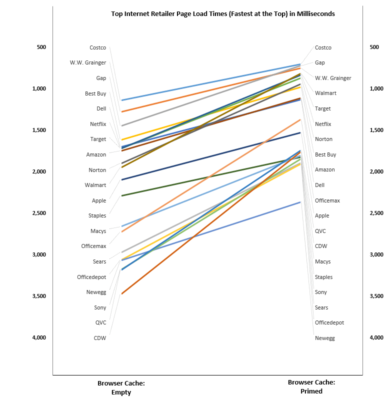
Hello everyone. In this WebTortoise Story, am going to use a Slopegraph to visualize the rank in Page Load Times RE: an Empty Browser Cache versus a Primed Browser Cache. Traditional data tables or bar graphs have always been used for this, but as Webtortoise is about the many different ways to visualize web performance data, let us begin.

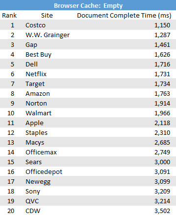
First, consider a general data table (not unlike the one below). It is showing the “Empty Cache” Average Document Complete Time (in ms) for some of the Internet’s top retail sites:

Webtortoise - Cache is King - 1

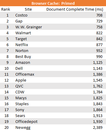
Second, consider a similar general data table showing the “Primed Cache” average Document Complete Time (in ms) for those same sites.

Webtortoise - Cache is King - 2

Pause….

Now consider such questions as:

— What is the rank of sites when considering an empty browser cache versus when considering a primed browser cache?

— Does the ordinal rank change?  And if so, by how much?

Now… place the tables side-by-side, draw lines between them and voila! you have your Slopegraph:

Webtortoise - Cache is King - 4

Fastest at the Top

There was much debate about whether or not the “fastest” site should be at the “top” or at the “bottom”.  Since were making a natural progression from a basic data table (which normally has the “fastest” at the top), decided to keep the “fastest” at the top when constructing the Slopegraph.
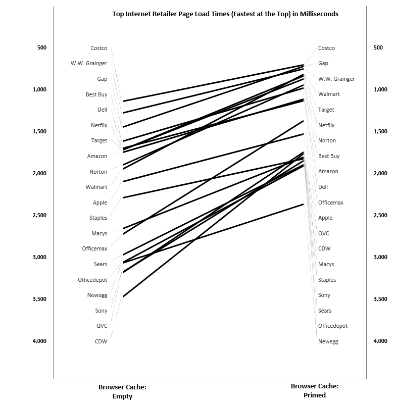
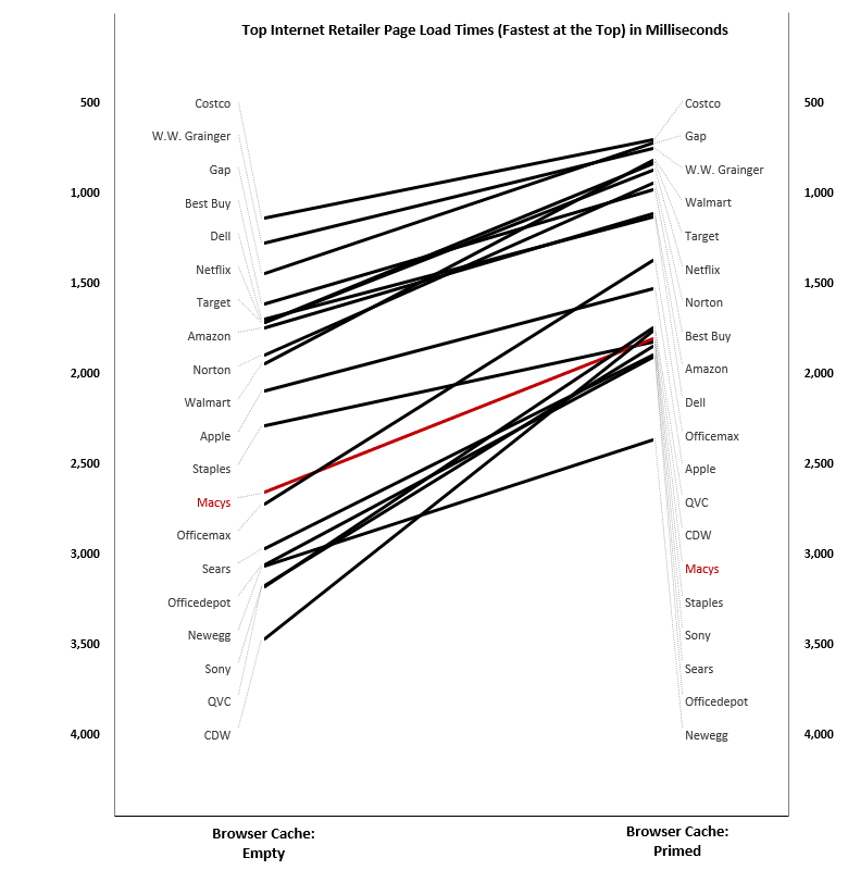
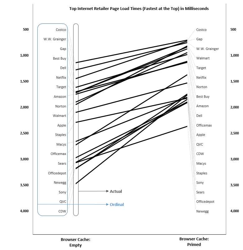
A Closer Look

One of the powerful capability assets of the Slopegraph is you get to visualize both, “the actual rank” and, “the ordinal rank”. This is exceptionally powerful because when you have *just* the data table, it’s tougher to do things like see clusters, compare magnitudes of change or see rank change(s).

In other words, the ordinal rank says, “So and so is first, such and such is second and so on”. But it does not say, “By how much is such and such second”? That’s why the visual is recommended because it conveys some of this certain information with much less exerted brainpower.

Webtortoise - Cache is King - 6

Optional Reading Material:

Download Excel: https://drive.google.com/file/d/0B9n5Sarv4oonTVd3dm01YWd1dlk/edit?usp=sharing

LinkedIn: http://www.linkedin.com/in/leovasiliou

Twitter: @LvasiLiou

#Analytics #CatchpointUser #ChartsAndDimensions #ChartsAndGraphs #Performance #SiteSpeed #WebPerformance #Webtortoise #WebPerf #WPO #DataVis

#ExcelSlopeGraph #CompetitiveBenchmark #CacheIsKing

2014-Feb-28

The Web Performance Hockey Stick Chart — Part 2 of 4

Web Performance Hockey Stick Chart -- 2 of 4 -- 1Web Performance Hockey Stick Chart -- 2 of 4 -- 2Web Performance Hockey Stick Chart -- 2 of 4 -- 3Web Performance Hockey Stick Chart -- 2 of 4 -- 4

Response:

Hello! This WebTortoise post was written 2014-FEB-28 04:59 PM ET.

Keep in Mind:

#- Use a cumulative distribution function (CDF) for its exceptionally-powerful force rank, competitive benchmarking and diff’ing capabilities (Note, in this post have affectionately referred to the CDF as, “The Hockey Stick” chart).

#- Use The Hockey Stick chart to compare fully-distributed performance data to other, fully-distributed performance data.

#- Credit to both Peltiertech.com and Chandoo.org for their logic on how to fill areas with color in Excel. Thank you, Gentlemen.

#- The actual Internet Retailer (“IR”) Top 20 competitive benchmark data in this post was of only the respective home page(s); It is benchmarking the [Fully Loaded] Webpage Response Time metric. Note the theory in this post could apply to any performance data (e.g. a full business transaction) or to any metric (e.g. Wait Time, Load Time or any internal KPI).

#- Constructing The Hockey Stick CDF is a computationally, exceptionally expensive proposition.

Story

Hello, Everyone. The idea of competitive benchmarking is not new. What is new here, however, is the proposed way of using the Hockey Stick CDF to do them.

I’ve found that most existing [web performance] competitive benchmarks do an “OK” job of comparing the summary statistics (e.g. the median or the average). But they don’t do a good enough job of showing the overall picture, nor of showing how far the overall pictures are from each other.

In this Webtortoise Story:

01. Are going to calculate the individual IR Top 20 performance medians and place them along the aggregate IR Top 20 Hockey Stick CDF curve. This will virtuously rank the median values from fastest to slowest.

02. Are going to calculate the Hockey Stick CDF of the individual IR Top 20 and compare to the calculated Hockey Stick CDF of the aggregate IR Top 20.  We will then calculate the net area between them and use that net area number as the mechanism to rank from fastest to slowest.

03. Are going to see whether the two different calculations result in different ranks.

Place the Individual Medians

I’ve run several tests against the IR Top 20 homepages.  Now use those individual test data to create The Hockey Stick CDF (aggregate curve) by using your various percentile functions (e.g. in Excel, use =PERCENTILE.EXC) and calculate the 1st through the 99th percentiles. Then chart these respective percentiles as a line.  In this below chart, there are 99 chart data (one for each of the 1st through 99th percentiles that we just calculated).

Note you may follow along with this excel spreadsheet (This excel spreadsheet was created in excel 2013 (PC) and contains advanced formatting. Unfortunately, the advanced formatting is necessary for this particular post. In the chance everything does not display perfectly, I’ve placed a supplemental PPT here. The PPT will contains various pictures/graphics, though it will not contain the formulas).

Web Performance Hockey Stick Chart -- 2 of 4 -- 1

Now place the individual IR Top 20 medians along the curve.  The long and short is you want your individual median to be as far to the left as possible.  Consider now how we can see better the disparity between the first place versus e.g. the last place.  Not only can we see the delta going up to down, but we can also see the delta going left to right.

Web Performance Hockey Stick Chart -- 2 of 4 -- 2

Compare the Full Hockey Stick CDFs

Now compare the individual IR Top 20 CDF to the aggregate IR Top 20 CDF and then fill the areas between them to [hopefully] give a better visual of just how far apart they are. At this point, be looking at the PPT slide four and beyond, and be looking at “Comparing Full Distributions” sheet of the Excel workbook. Right around cell AJ35 of this “Comparing Full Distributions” sheet, there is a scroll button where you can scroll through the IR Top 20 and see the differences; this post is showing only Costco (the “fastest”) and Macys (shown because it crosses over a few times, and this is a separate conversation on its own).

Web Performance Hockey Stick Chart -- 2 of 4 -- 3

Web Performance Hockey Stick Chart -- 2 of 4 -- 4

When the lines cross each other (perhaps several times) as with the Macys data, it becomes more apparent as to why we need to calculate the net area between the comparison(s).  So, calculate all the “red” area…. calculate all the “green” area and take the difference of the two.  The result will be one of three things:  net faster, net slower or net zero.  By doing it this way, we are now truly comparing the full distribution of the performance data.

Comparing the Ordinal Rank of the Two Different Calculations

There were only slight differences between ranking the two calculations. Or perhaps, that should be phrased as a question instead of a statement. E.g., “Are the differences between ranking the two calculations substantial or insubstantial”? … Interesting. We can say, though, at least the first and last place(s) did not change. So perhaps that’s how we should approach, by doing multiple calculations and seeing the rank that way? So if an entity was in the same slot in multiple methods, then we build confidence… right?

Either way, good job to Costco.  Those are some amazing web performance numbers!

Web Performance Hockey Stick Chart -- 2 of 4 -- 5

Optional Reading Material:

Download Excel File https://drive.google.com/file/d/0B9n5Sarv4oonQzFZbElNQ3NaVkU/edit?usp=sharing

Download PPT File  https://drive.google.com/file/d/0B9n5Sarv4oonS1RIWHpyMzZPdW8/edit?usp=sharing

LinkedIn: http://www.linkedin.com/in/leovasiliou

Twitter: @LvasiLiou

#Analytics #CatchpointUser #ChartsAndDimensions #ChartsAndGraphs #Performance #SiteSpeed #WebPerformance #Webtortoise #WebPerf #WPO #DataVis

#ExcelHockeyStick #WebPerformanceHockeyStick #Percentile #CompetitiveBenchmark

Blog at WordPress.com.